Search for content of interest

  • About
  • ServiceS
    • Branding
    • Innovation
    • Naming
    • Strategy
    • Research
    • Design
  • Work
  • Insights
  • News
  • LOCATIONS
    • Shanghai
    • Paris
    • New York
    • Singapore
    • Malaysia

CN FR
  • About
  • ServiceS
    • Branding
    • Innovation
    • Naming
    • Strategy
    • Research
    • Design
  • Work
  • Insights
  • News
  • LOCATIONS
    • Shanghai
    • Paris
    • New York
    • Singapore
    • Malaysia
CONTACT

EN

  • CN
  • FR

Home Our Work Detail

EXPERTISE

  • Design
  • Branding

REGION

  • Global
  • China
  • APAC

INDUSTRY

  • FMCG
Contact Us

Sprite Beverage Packaging Design with a New Visual Identify System

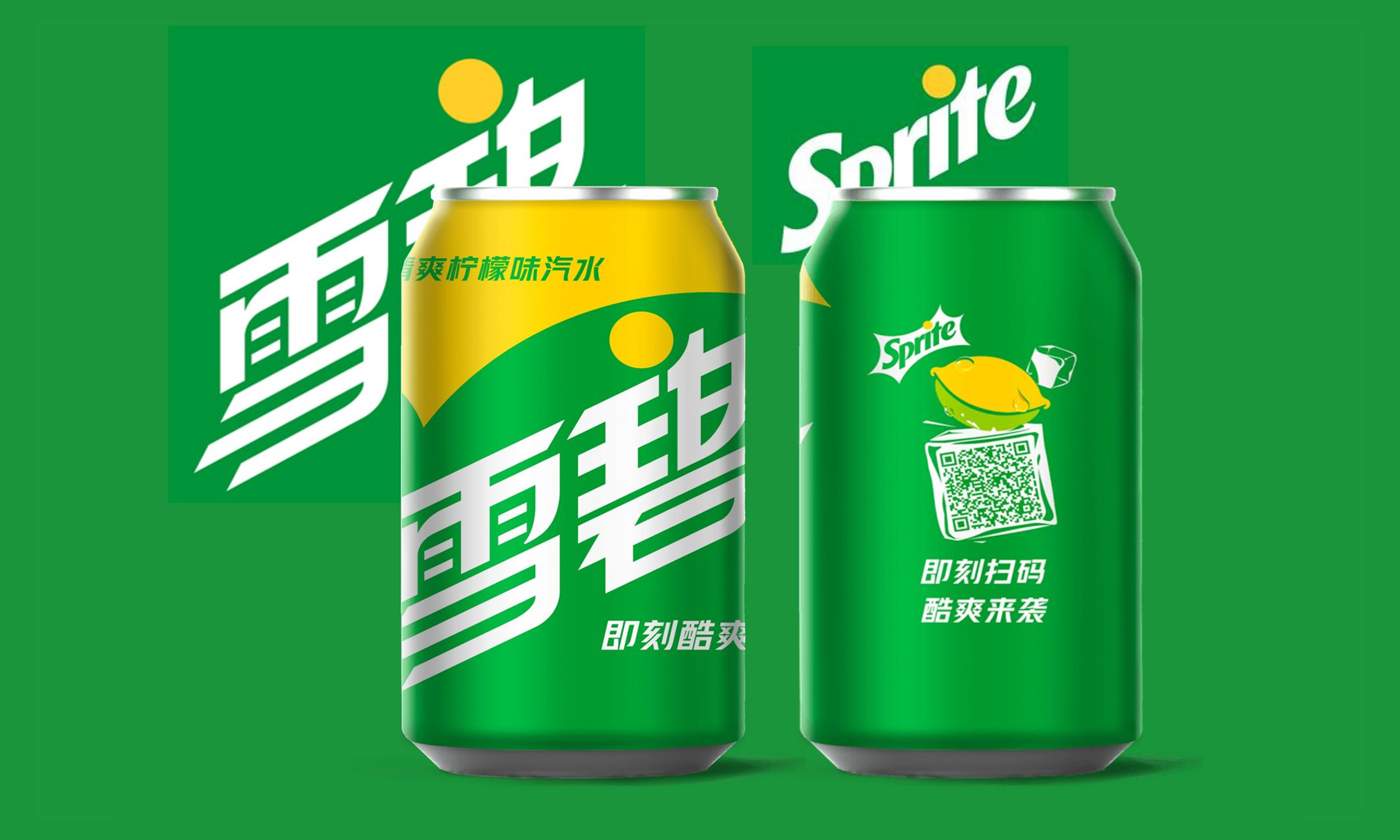
SPRITE is one of China’s leading brands. To further enhance the connection and relevance with a new generation of consumers today, Labbrand was invited to conceptualize and support the brand rejuvenation for China. The strategic objectives are aimed at bringing SPRITE to life, de-aging an aging brand through beverage packaging design of SPRITE with its core label experience.

Challenge

Over the years, the brand has not changed and has started to appear weary and “dated” to current and would-be future audiences. It is a critical time for SPRITE to make a refreshing splash and impact the category.
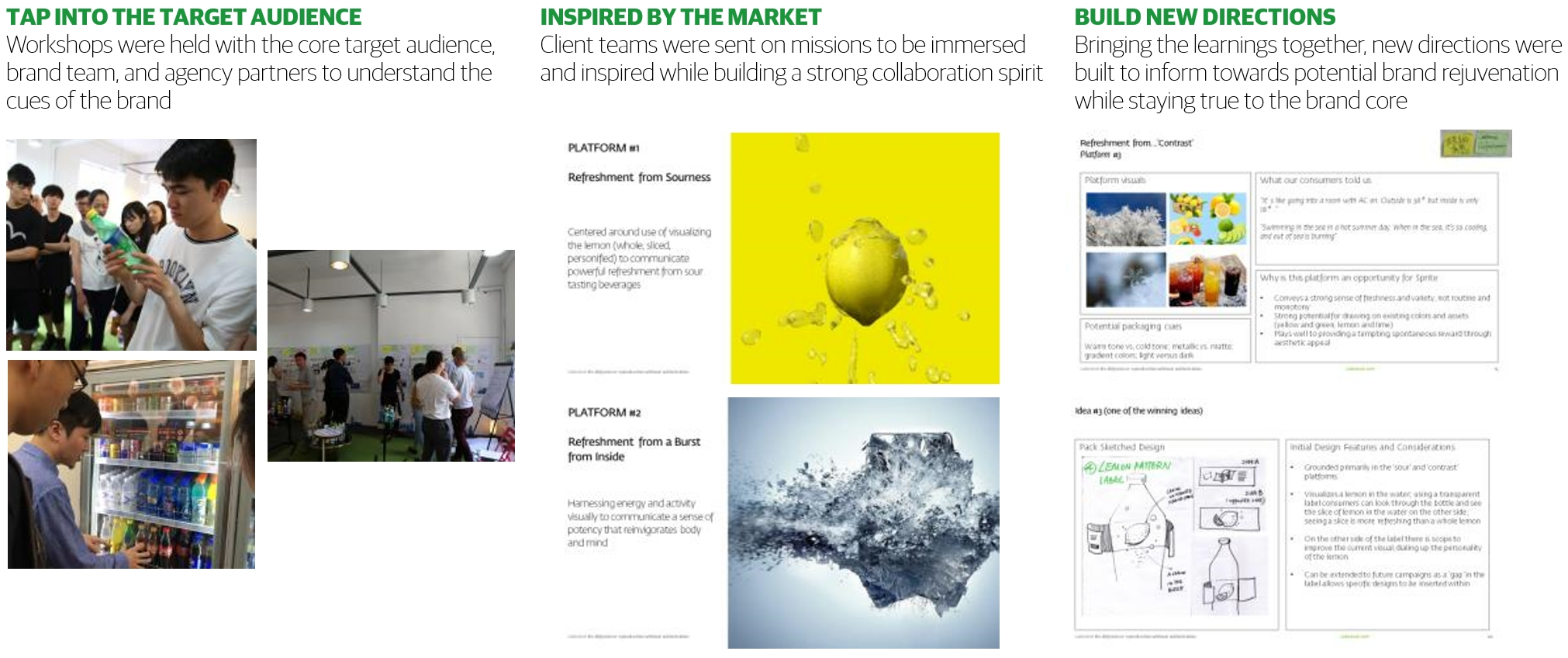
Sprite new signature for China
SPRITE new signature for China

Solution

Design Strategy

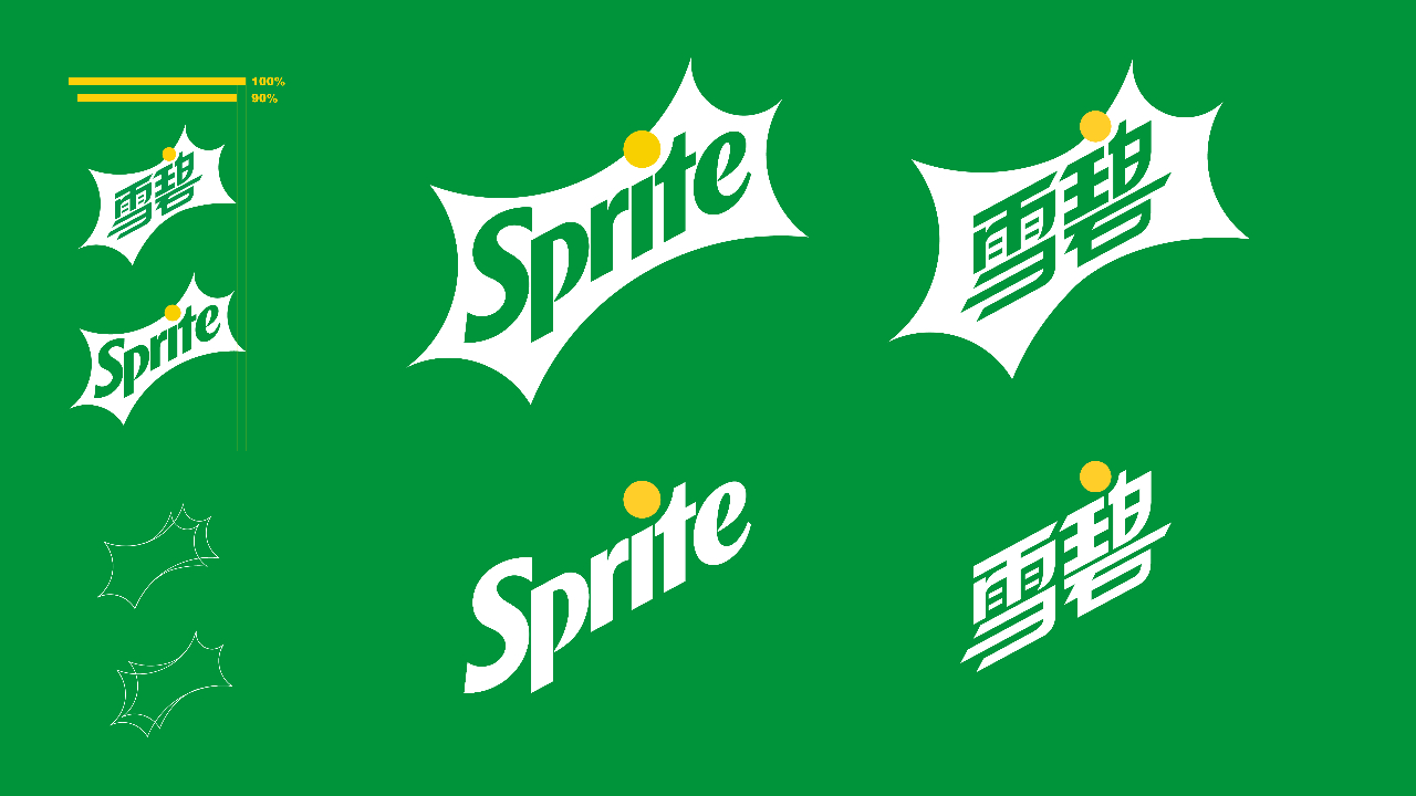
The SPRITE packaging design strategy by Labbrand was to identify which of the elements from the original SPRITE visual identity system were best to be leveraged and what was to be further explored.

We explored the Sparkline as a graphic tool for creating dynamic and versatile compositions, used typography design to emphasize the brand’s truth and product variations, and leveraged the color of the bottle to amplify refreshment cues, by means of contrast or integration with the label design.

Sprite Beverage Packaging Design

Creativity & Innovation

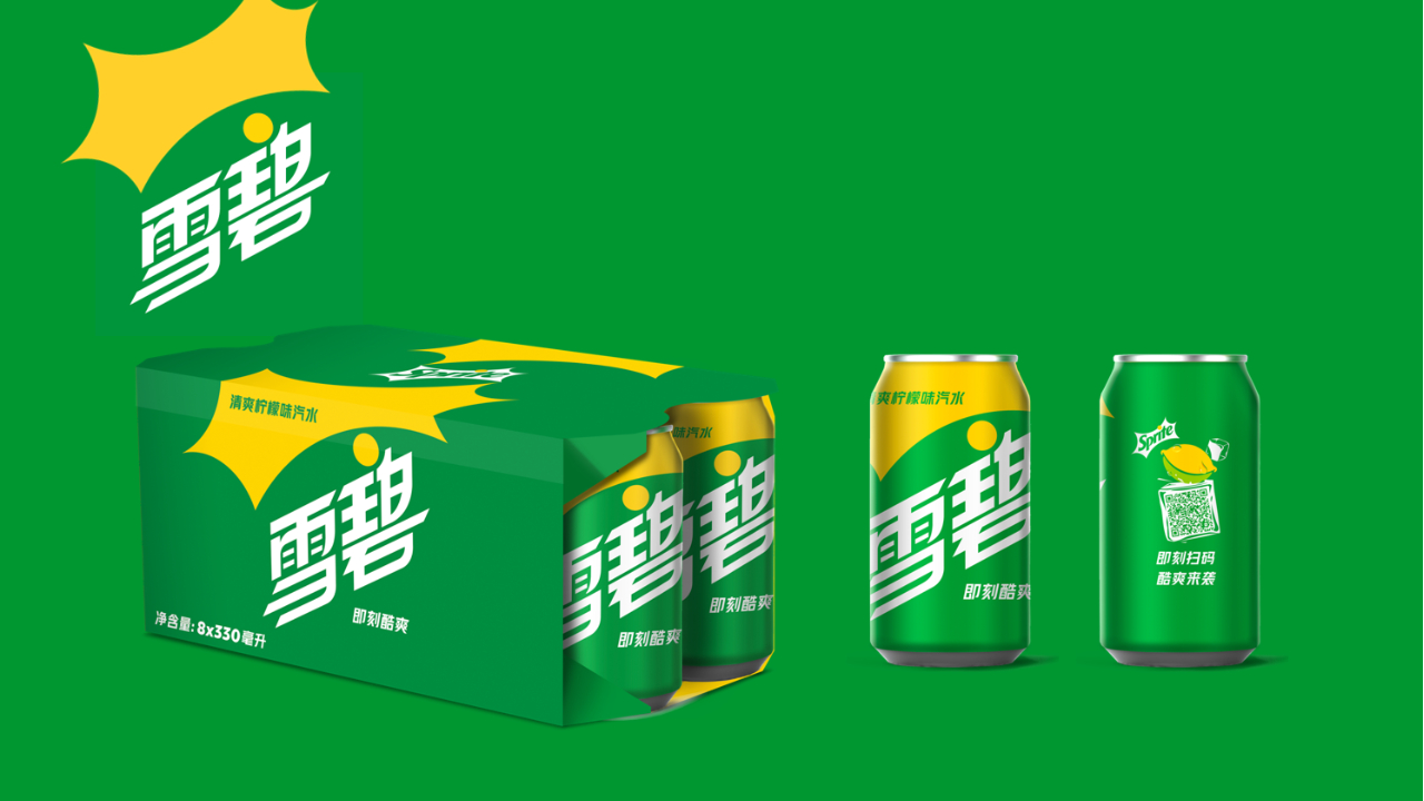
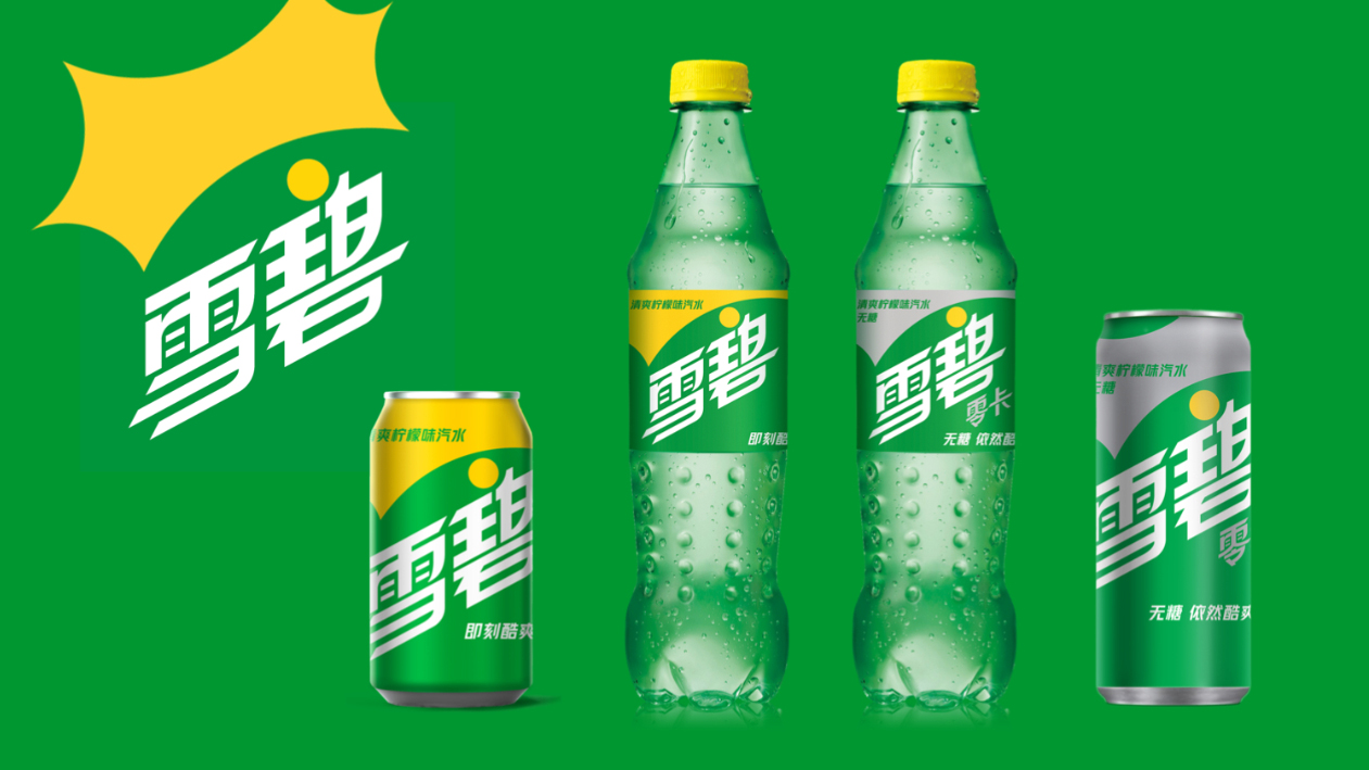
To keep the irreplaceable feeling of the natural, crisp flavor of SPRITE when drinking it right after a thirst, the instant moment of liberation and a sudden hit of refreshment is expressed through utilizing visually refreshing and liberating cues (Lemon/Lime, sparkling bubbles, splashes, ice, etc.) that emphasize SPRITE’s Vision and very well reflects the edgy, authentically cool and yet polished personality of SPRITE’s brand identity.

Cans and cartons featuring Sprite packaging design

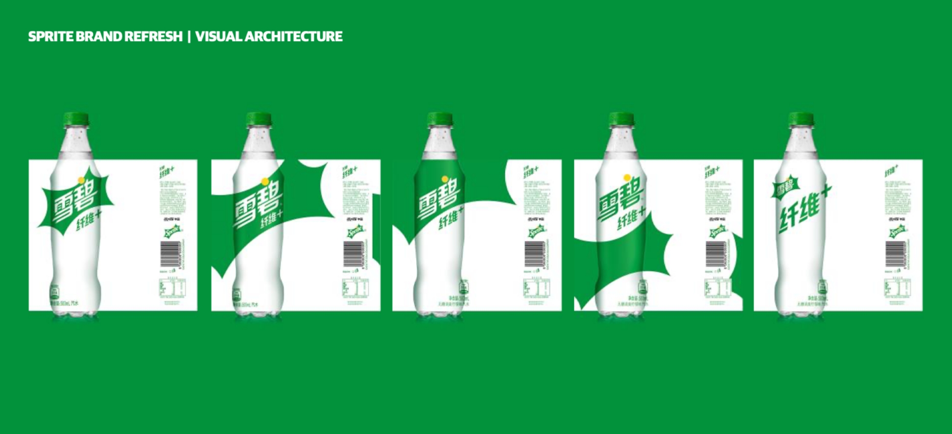
Brand Portfolio Visual Architecture

Following the signature creation, Labbrand was tasked to develop the packaging design for two product categories proposed by the Brand team:

SHAPE represents the core Sprite products (Core + Zero) plus any future flavor variants; thus, the visual architecture for the Shape line must be unified globally to secure brand equity.

EXPAND is a category that ”expands” from the core offerings.
This includes Sprite Fiber+, Sprite Juice, and any future products containing additional ingredients/benefits. Therefore, there is an opportunity to deviate from Shape category’s visual architecture.

The key objective was to express a unique design for each Expand product that still encapsulates Sprite’s brand edge of “cool, sudden refreshments”.

Sprite Beverage Packaging Design

Results

The new signature design successfully allows maximum flexibility for future variant extensions. Iconography communicating each flavor variant can be introduced and displayed as a clear message to consumers, with foresight into the adoption of a one-brand strategy. 

With the establishment of this new beverage packaging design, the brand creates a renewed connection with the Chinese younger generation in the modern context and thus rejuvenates its brand image while still keeping its brand integrity.

Sprite logo design
Different products showing Sprite beverage packaging design
  • SHARE
  • 
  • 
  • 
  • 
BACK

Sign up for our newsletter to get the latest insights, tips, and trends in branding, naming and innovation.

Related Article




HARPIC Chinese Brand Name Creation

Originated in the UK, HARPIC is a toilet cleaning brand that has a century-old history. As a global leading brand in the category of sanitary toilets, HARPIC is not only …

Gucci Market Strategy in China: Gucci Customer Insights Research

Embark on the strategic journey of Gucci's market strategy in China with Labbrand. Through in-depth analysis, Labbrand examines Chinese consumers' perception of "authenti…

Changing The Face of Luxury Travel: Destinations Within Reach

Club Med, renowned for its luxurious, all-inclusive experiences across global destinations, recognized a key shift in the travel habits of urban Chinese consumers. To mee…

Continental Chinese Tagline Creation

Labbrand developed the Chinese tagline creation for Continental for a promising future. HIT THE ROAD Founded in 1871 German, Continental AG is a world’s leading manufactu…

CeraVe Chinese Brand Naming

Labbrand worked with CeraVe to create the Chinese brand name 适乐肤, bringing products that are simple, soothing and friendly to all skin type to Chinese consumers. CeraVe w…

L’ORÉAL & LABBRAND: Clean Beauty in Luxury Skincare

In the ultra-premium skincare category, even the most iconic products must evolve to stay ahead of rising consumer expectations and shifting regulatory landscapes. To ens…

Labbrand Creates Food Product Name in Chinese for HARIBO

SHANGHAI, 23 OCTOBER, 2017 – HARIBO, world’s renowned confectionery brand from Germany, has introduced 3 new products in China carrying the food product name created by L…

DS Auto Brand Experience

Labbrand creates a scent for DS to effectively convey the brand image and increase customers' purchase intent through unique auto brand experience. INSPIRIT UNIQUE SENSOR…

Ready to take your brand to new heights?

Let's start a conversation.
  • NEWSLETTER
  • CAREERS
  • PRIVACY POLICY
  • Labbrand Group
  • Labbrand
  • Madjor
  • SpringPillar

* Will be used in accordance with our Privacy Policy

A Labbrand Group Company © 2005-2025 Labbrand All rights reserved

沪ICP备17001253号-3
  • Follow us:
  • 
  • 
  • 
  • 
  • 
  • 

Contact us to get the latest insights, tips, and trends in branding, naming, and innovation.

* Will be used in accordance with our Privacy Policy

Cookie Notice

To improve your experience, we use cookies to provide social media features, offer you content that targets your particular interests, and analyse the performance of our advertising campaigns. By clicking on “Accept” you consent to all cookies. You also have the option to click “Reject” to limit the use of certain types of cookies. Please be aware that rejecting cookies may affect your website browsing experience and limit the use of some personalised features.

Accept Reject