Search for content of interest

  • About
  • ServiceS
    • Branding
    • Innovation
    • Naming
    • Strategy
    • Research
    • Design
  • Work
  • Insights
  • News
  • LOCATIONS
    • Shanghai
    • Paris
    • New York
    • Singapore
    • Kuala Lumpur

CN FR
  • About
  • ServiceS
    • Branding
    • Innovation
    • Naming
    • Strategy
    • Research
    • Design
  • Work
  • Insights
  • News
  • LOCATIONS
    • Shanghai
    • Paris
    • New York
    • Singapore
    • Kuala Lumpur
CONTACT

EN

  • CN
  • FR

Home Our Work Detail

EXPERTISE

  • Naming
  • Design
  • Branding

REGION

  • Global

INDUSTRY

  • Auto
  • Professional & Financial Services
  • Industrial & Chemical
  • Supply chain
Contact Us

DISTRIGO Alphabetic Name Creation and Visual Identity Design

Labbrand helped Groupe PSA with the alphabetic name creation and visual identity design for the brand DISTRIGO.

Groupe PSA is the leader in both the construction of excellent vehicles and the provider of innovative mobility solutions. The vision of Groupe PSA is to become a benchmark automotive manufacturer and supplier of mobility solutions, to enrich the freedom of movement of our customers every day, all over the world.

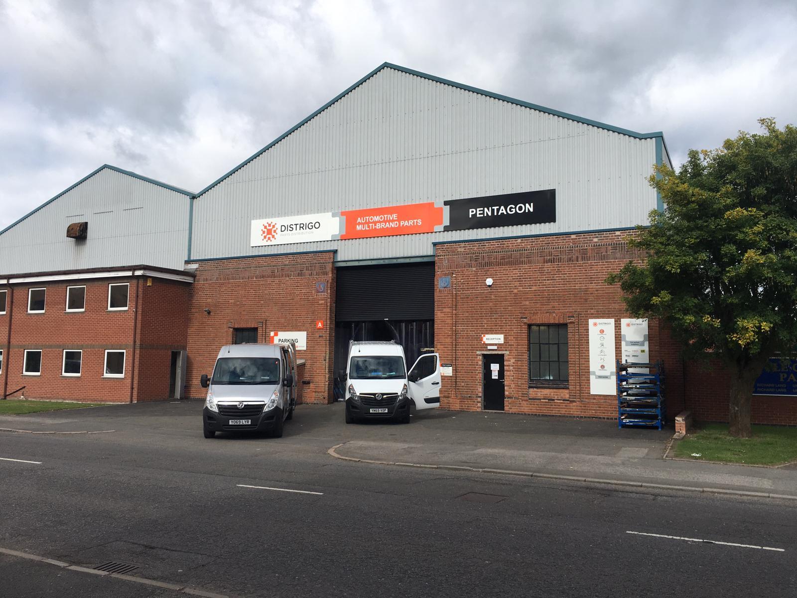
As part of the development of the secondary market, Groupe PSA, the French automobile company (which owns the Peugeot, Citroën and DS car brands), is launching a new multi-brand spare parts distribution service around the world.

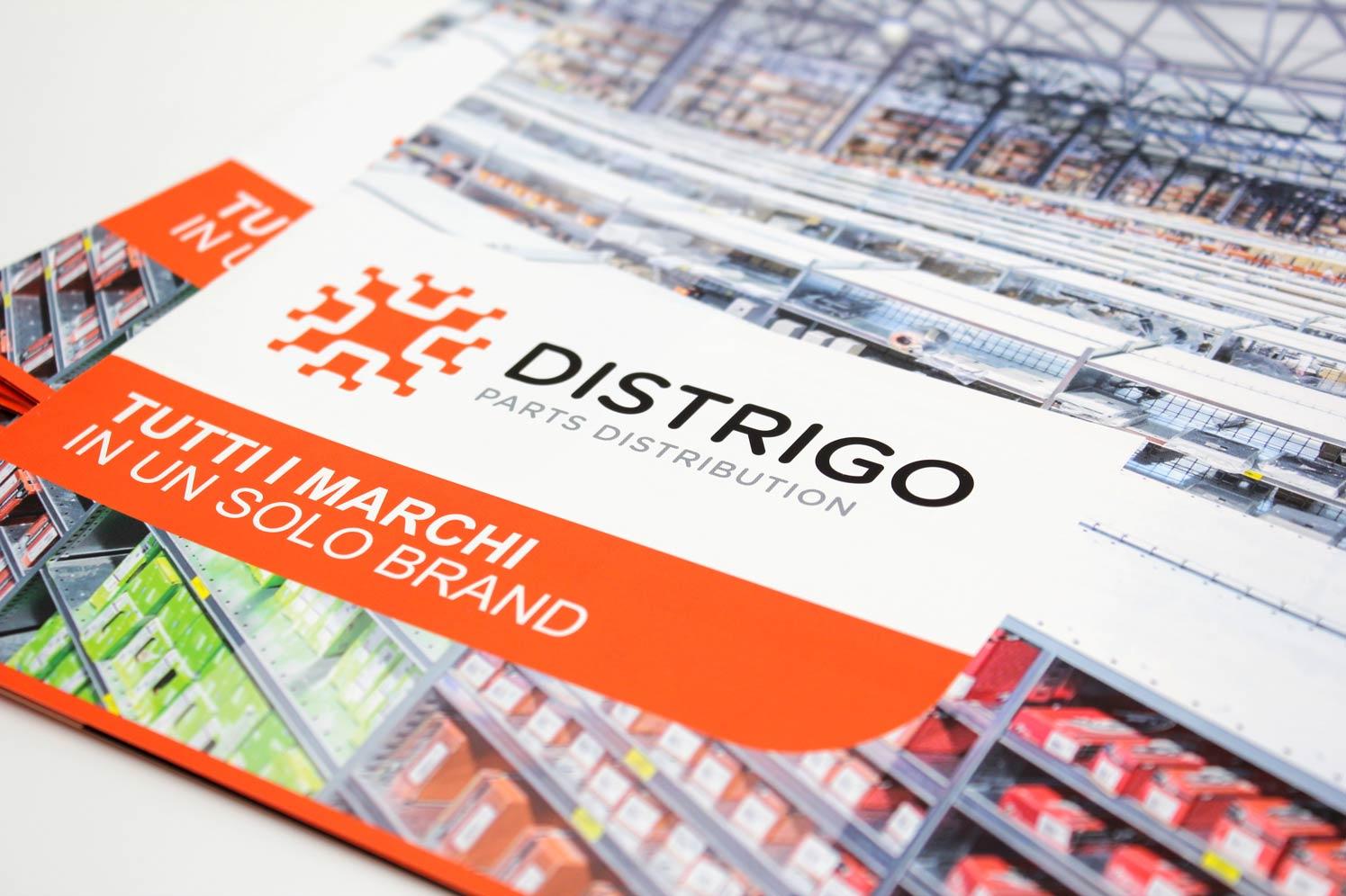
Labbrand created the alphabetic name and visual identity for the new service. The aim was to communicate the attributes of the brand in a simple and easy style. Labbrand created the brand name ‘DISTRIGO’. Combining the alphabetic descriptive part ‘distri’ (of the distribution) and the English word ‘GO’, DISTRIGO is customer-centric and reflects the offering of the brand: speed and movement. The name is also easy to rhyme and memorise.

The visual identity was developed around the idea of ​​network, connection and interaction between the brand, suppliers, distributors and repair shops. Its modern and technological oriented, which echoes the image of an electrical circuit, anchors the service in an efficient and interactive distribution approach in the 21st century.

The font and color coding are in line with the group’s activities in other markets, while perfectly reflecting simplicity and dynamics.

  • SHARE
  • 
  • 
  • 
  • 
BACK

Sign up for our newsletter to get the latest insights, tips, and trends in branding, naming and innovation.

Related Article




Sprite Packaging Design

Labbrand created the new product variant packaging and wordmark design for SPRITE Juice with its first flavor variant ICY Coconut. BACKGROUND SPRITE China …

MasterControl Chinese Brand Signature Development

MasterControl is changing and growing as a Chinese brand. It has a special brand signature design that makes it stand out. It used to sell systems to manage quality, but …

Reimagining Vita Coco: A Strategic Localization Journey

Since its global debut in 2004, Vita Coco has revolutionized the coconut water category with its promise of natural hydration and wellness. By the time the brand entered …

Lancôme – Unveiling Sustainable Luxury Through Grasse Storytelling

Background  Lancôme purchased the Domaine De La Rose estate in Grasse in 2020 to create sustainable products for their new range of fragrances, which aligned with th…

Outspan in China: Outspan Creative Concept Creation

Outspan in China - Project Background Explore the presence of Outspan in China, an international citrus brand from South Africa since 1936. Renowned for exporting premium…

QUORN Brand Activation and Repositioning Strategy

Labbrand assisted Quorn, a meatless food brand, in overcoming low receptivity in Asian markets and repositioning the brand. Through market localization and the REACT meth…

Carom: Redefining Experiences through Social App Name Creation

Labbrand created a distinctive social app name for Carom that aimed to revolutionize social interactions and networking among successful professionals. The chosen name, C…

Red & Refined – Gran Meliá’s Signature Touch of Luxury

At Gran Meliá, luxury is not just served with a silver spoon, it is served with a splash of Red – Spanish Red, to be precise. Red has always been the color of passion, po…

Ready to take your brand to new heights?

Let's start a conversation.
  • NEWSLETTER
  • CAREERS
  • PRIVACY POLICY
  • Labbrand Group
  • Labbrand
  • Madjor
  • SpringPillar

* Will be used in accordance with our Privacy Policy

A Labbrand Group Company © 2005-2025 Labbrand All rights reserved

沪ICP备17001253号-3
  • Follow us:
  • 
  • 
  • 
  • 
  • 
  • 

Contact us to get the latest insights, tips, and trends in branding, naming, and innovation.

* Will be used in accordance with our Privacy Policy

Cookie Notice

To improve your experience, we use cookies to provide social media features, offer you content that targets your particular interests, and analyse the performance of our advertising campaigns. By clicking on “Accept” you consent to all cookies. You also have the option to click “Reject” to limit the use of certain types of cookies. Please be aware that rejecting cookies may affect your website browsing experience and limit the use of some personalised features.

Accept Reject