Search for content of interest
  • About
  • ServiceS
    • Branding
    • Innovation
    • Naming
    • Strategy
    • Research
    • Design
  • Work
  • Insights
  • News
  • LOCATIONS
    • Shanghai
    • Paris
    • New York
    • Singapore
    • Kuala Lumpur

CN FR
  • About
  • ServiceS
    • Branding
    • Innovation
    • Naming
    • Strategy
    • Research
    • Design
  • Work
  • Insights
  • News
  • LOCATIONS
    • Shanghai
    • Paris
    • New York
    • Singapore
    • Kuala Lumpur
CONTACT

EN

  • CN
  • FR

Home Our Work Detail

EXPERTISE

  • Naming
  • Research

REGION

  • Global
  • China
  • APAC

INDUSTRY

  • Tech & Digital
  • Hospitality & Real Estate
Contact Us

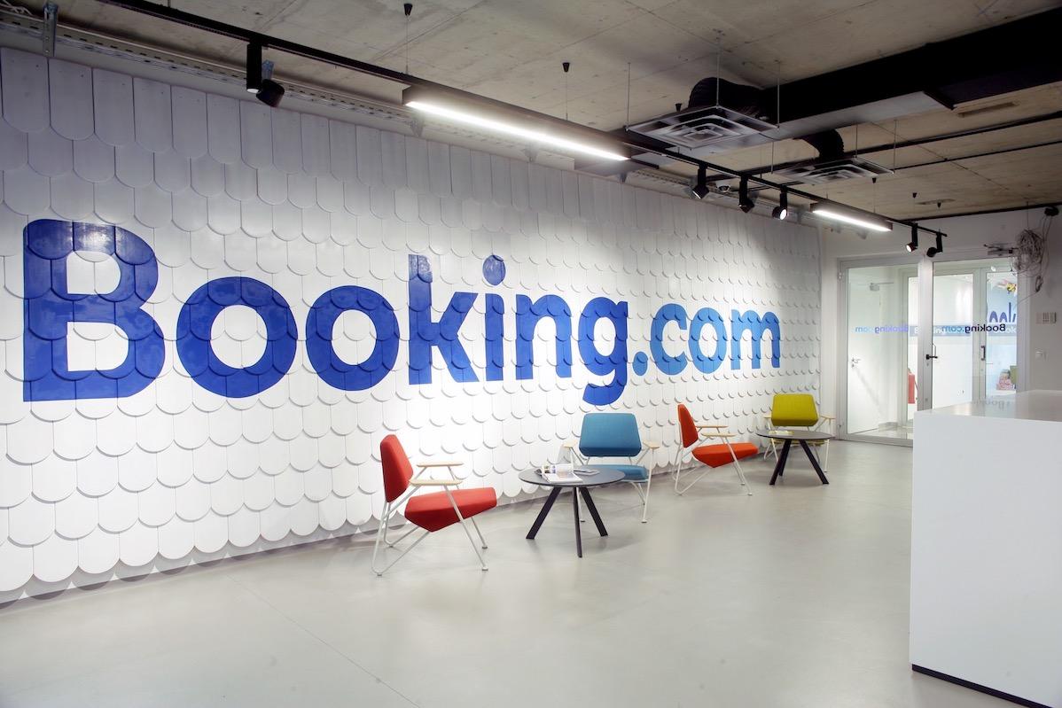
Booking.com Chinese Brand Name Creation

Booking.com Chinese Brand Name Creation Overview

Brand Naming Strategy: Localizing Booking.com for the Chinese Market

Labbrand succeeded the Chinese brand name creation 缤客 [bīn kè] for Booking.com, building strong brand awareness in Chinese market. 

TRAVEL THE WORLD

Established in 1996 with its headquarters in Amsterdam, Booking.com is a worldwide hotel booking company that offers more than 212,000 affiliated hotels in over 160 countries around the world. With a state-of-the-art search engine, Booking.com meets the needs of a global traveler.

BUILD THE NEW BOND

While its competitors already had well-known Chinese brand names, Booking.com was behind the trend. In order to have better communication in the Chinese market, Booking.com searched for a new Chinese brand name creation that would be easily understood by a Chinese audience while gaining a broader consumer base.

START OFF THE JOURNEY

The Chinese brand name creation for Booking.com succeeded by considering its brand attributes and finding locally relevant names within the Chinese market. 缤客 [bīn kè] was the final choice. This name brings out the key values of Booking.com. To analyze character by character, 缤客 [bīn kè], expresses such a motto as “Every guest is welcome”; 缤 [bīn] carries the connotation of mixed colors because of the fixed phrase “五彩缤纷” ([wǔ cǎi bīn fēn], meaning colorful) and delivers a sense of abundance, inclusion and approachability; 客 [kè] means the guests of a business while also rendering a sense of courtesy and modesty—two important values for mass service providers like Booking.com. Altogether, this name truly reflects what Booking.com really is—approachable, friendly, informative and reliable—a means to finding your next “home” in the world.


  • SHARE
  • 
  • 
  • 
  • 
BACK

Sign up for our newsletter to get the latest insights, tips, and trends in branding, naming and innovation.

Related Article




Axent Chinese Website: Axent Brand Website Creation

Axent Chinese Website - INNOVATE DNA WITH SWISS HERITAGE Discover the answer with Axent Chinese Website – a strategic move by a local OEM in the intricate landscape of Ch…

Creating Key Visuals and Brand Design Strategy for Rheinmetall

LABBRAND delivered Rheinmetall Automotive 4 new key visualization concept and brand design strategy. Brand Design Strategy: TECHNOLOGIES FOR MOBILITY Rheinmetall Automoti…

Brand Identity in China – SWEETPEARL

Discover how Labbrand leverages its expertise to create a compelling brand identity in China for SweetPearl. Through strategic brand positioning, Labbrand develops a verb…

Royal Salute Brand Positioning Consumer Study 

Background  Royal Salute has set an ambitious course: double its global net sales value by 2025 and claim the No. 1 spot in prestige Scotch by 2035. A refreshed posi…

Global Verbal Identity Research for Vrbo

Background Vrbo, the vacation rental marketplace, in 2018 was working towards a harmonized brand identity in global markets, giving consideration to meaning, recall, and …

A Winning Brand Architecture Strategy for Legrand

Labbrand built a clear and sustainable brand architecture strategy for Legrand to answer its long-term growth needs. Brand Architecture Strategy - GLOBAL SPECIALIST Legra…

Nespresso Chinese Brand Strategy

Embark on the journey of Nespresso's Chinese brand strategy with Labbrand, as they tackle the challenge of enhancing Nespresso's presence in the China market. Recognizing…

Visual Identity Creation: ATAWAY Brand Identity Creation

Explore the realm of visual identity creation with Labbrand as they meticulously design verbal and visual identities for Ataway, an international consulting firm speciali…

Ready to take your brand to new heights?

Let's start a conversation.
  • NEWSLETTER
  • CAREERS
  • PRIVACY POLICY
  • Labbrand Group
  • Labbrand
  • Madjor
  • SpringPillar

* Will be used in accordance with our Privacy Policy

A Labbrand Group Company © 2005-2025 Labbrand All rights reserved

沪ICP备17001253号-3
  • Follow us:
  • 
  • 
  • 
  • 
  • 
  • 

Contact us to get the latest insights, tips, and trends in branding, naming, and innovation.

* Will be used in accordance with our Privacy Policy

Cookie Notice

To improve your experience, we use cookies to provide social media features, offer you content that targets your particular interests, and analyse the performance of our advertising campaigns. By clicking on “Accept” you consent to all cookies. You also have the option to click “Reject” to limit the use of certain types of cookies. Please be aware that rejecting cookies may affect your website browsing experience and limit the use of some personalised features.

Accept Reject