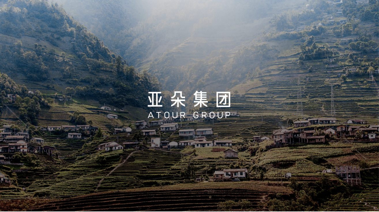
Over the past decade, Atour Group has achieved remarkable growth in the hospitality sector, evolving from a single-brand hotel business into a multi-brand hospitality group encompassing eight sub-brands and nearly 2,000 properties across China.
As the brand portfolio expanded and the number of hotels surged, maintaining centralized control over visual execution became increasingly difficult. Numerous logo variations emerged across internal and external communications, while photography and visual styles diverged from one touchpoint to another. Within such a large-scale network, these inconsistencies became challenging to manage systematically, posing a risk to the long-term strength of the brand.
At the same time, key questions surrounding the visual architecture required clarification: How should the relationship between Atour Group and Atour Hotels be expressed visually? How should the iconic “A” symbol be governed and applied? And how could the identity system remain flexible enough to support future brand expansion?
To address these challenges, Atour Group and Atour Hotels needed a clear and comprehensive visual governance system—one capable of expressing the Group’s core philosophy while providing practical guidance for implementation.
The objective was to establish a systematic framework that clearly differentiated the visual expression, design elements, and imagery styles of Atour Group and Atour Hotels. By equipping the central design team with consistent standards, the system could be effectively cascaded across more than 2,000 properties nationwide, guiding local execution while ensuring a cohesive and recognizable brand experience.
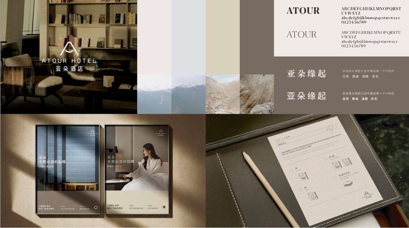
We first established clear distinctions between the visual applications of Atour Group and Atour Hotels. For the Group, we developed differentiated logo configurations tailored to corporate and public-facing communications. Most notably, we defined for the first time that “ATOUR” would serve as the unified service-platform identifier for all public-facing communications at both Group and cross-brand levels.
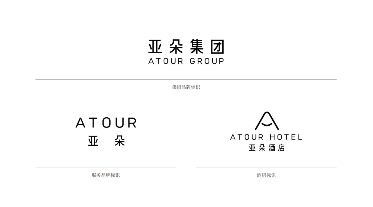
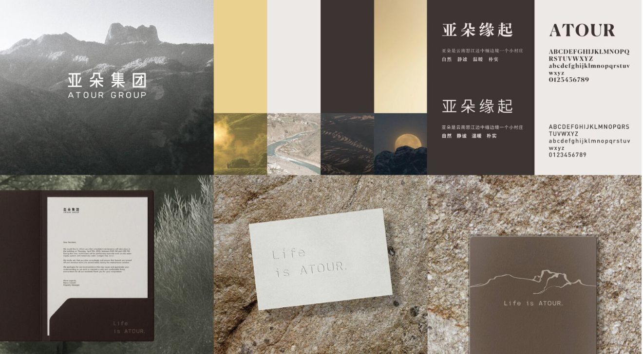
Drawing inspiration from the story of Atour Village—the brand’s place of origin—and its philosophy of “the power of inner calm,” we translated core brand values into typography, color systems, and application guidelines. Through careful refinements to letterforms and spacing, we enhanced visual elegance and comfort while preserving existing brand recognition, reinforcing Atour’s warm and human-centered character.
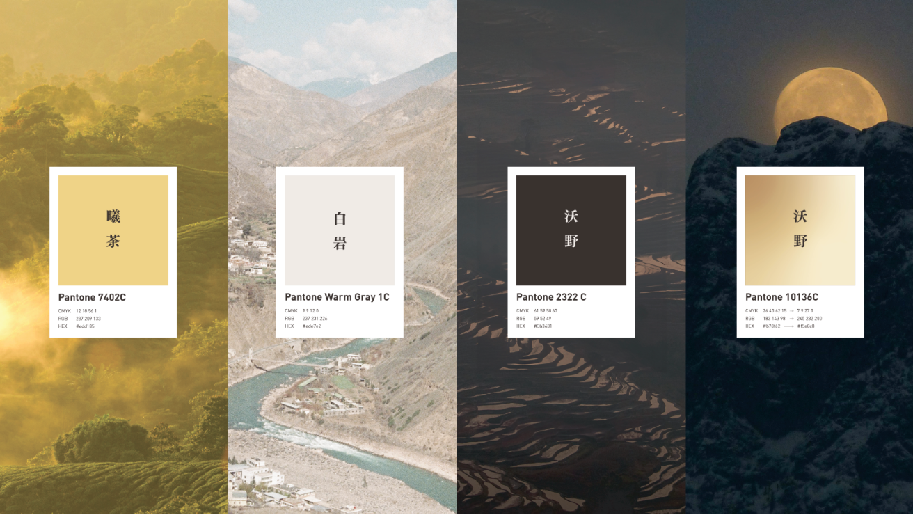
Building on the narrative of Atour Village, Labbrand also developed the “A Quiet Day in Atour Village” color storytelling system. Four core colors—Dawn Tea, Moonlight Glow, White Cliff, and Fertile Fields—were defined and organized within a cohesive narrative framework capable of unifying the color expressions of all brands across the Group.
Beyond the core identity, Labbrand established comprehensive guidelines for photography and illustration styles for both Atour Group and Atour Hotels, creating a consistent visual experience across future communications. We also extended the system into hotel amenities and collateral, while providing detailed guidance for outdoor advertising templates, signage systems, and storefront applications.
Combining extensive expertise in visual identity systems with first-hand field observations, Labbrand developed a visual strategy that balanced immediate practicality with long-term scalability.
Throughout the project, brand strategy and visual design were closely integrated, ensuring that Atour’s core philosophy was expressed consistently and meaningfully across every touchpoint. At the same time, the new framework established clear principles for visual governance and provided actionable implementation guidance across multiple channels and scenarios.
The result is a visual identity system capable of scaling across more than 2,000 hotels—bringing Atour’s distinctive spirit to life while ensuring consistency, flexibility, and long-term brand growth.


To improve your experience, we use cookies to provide social media features, offer you content that targets your particular interests, and analyse the performance of our advertising campaigns. By clicking on “Accept” you consent to all cookies. You also have the option to click “Reject” to limit the use of certain types of cookies. Please be aware that rejecting cookies may affect your website browsing experience and limit the use of some personalised features.