Search for content of interest

  • About
  • ServiceS
    • Branding
    • Innovation
    • Naming
    • Strategy
    • Research
    • Design
  • Work
  • Insights
  • News
  • LOCATIONS
    • Shanghai
    • Paris
    • New York
    • Singapore
    • Malaysia

CN FR
  • About
  • ServiceS
    • Branding
    • Innovation
    • Naming
    • Strategy
    • Research
    • Design
  • Work
  • Insights
  • News
  • LOCATIONS
    • Shanghai
    • Paris
    • New York
    • Singapore
    • Malaysia
CONTACT

EN

  • CN
  • FR

Home Our Work Detail

EXPERTISE

  • Design
  • Branding

REGION

  • China

INDUSTRY

  • Tech & Digital
  • Hospitality & Real Estate
Contact Us

Fliggy Brand Identity Creation and VI Design

Labbrand embarked on a transformative journey as it undertook the challenge of redefining the brand identity of Alitrip, transforming it into Fliggy and developing a comprehensive visual identity (VI) design system.  Positioned as an online travel agency (OTA) under the Alibaba umbrella, Fliggy set its sights on becoming the premier option for millennials shaping their travel dreams, with a special emphasis on international voyages. Labbrand aimed to create a unique and impressive brand image that could differentiate Fliggy in the highly competitive OTA market in China.
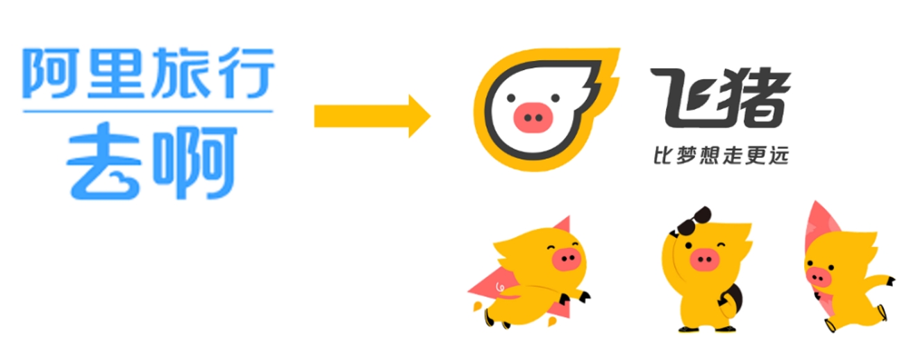
Alitrip to Fliggy

Challenge

Labbrand faced the challenge of creating a distinctive brand identity for Fliggy that would stand out in the crowded OTA market. The goal was to capture the attention of millennials and effectively communicate Fliggy’s diverse, convenient, and quality travel-related services. This challenge demanded a fusion of creativity and strategic thinking, ensuring that Fliggy’s essence was not just seen but deeply felt, setting it apart as a beacon in the realm of travel experiences.

Solution

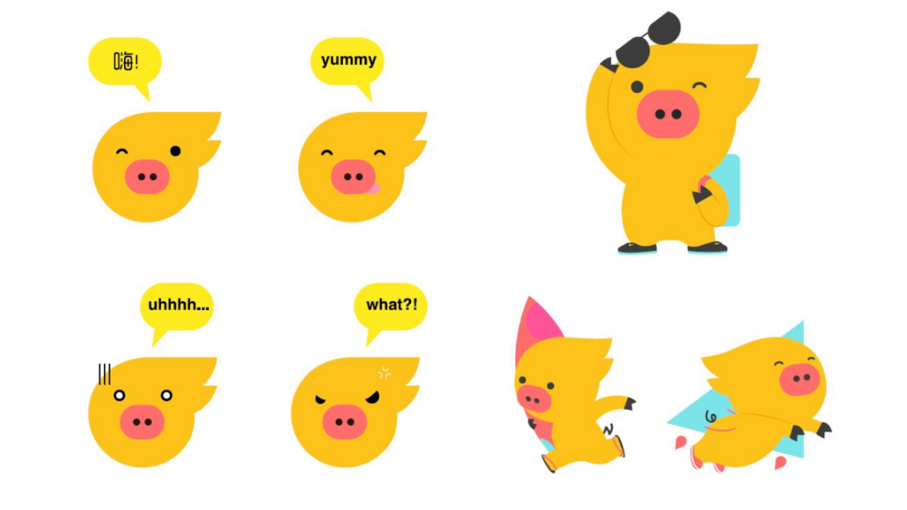
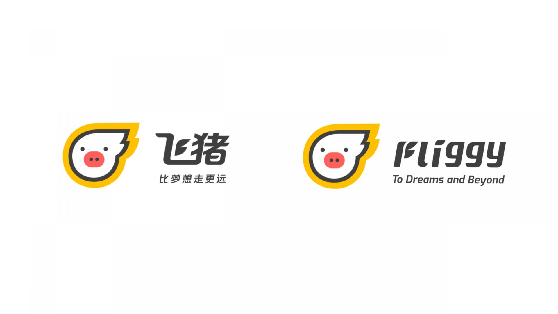
Labbrand worked closely with Alibaba to create a distinct and lively brand image for Fliggy. Instead of conventional approaches, Labbrand designed the lovable mascot “Fliggy” as a flying piggy, representing the concept that “traveling is just like being a pig – we eat, sleep, and have fun.” The design featured unique elements like “flying hairs” to depict Fliggy’s dynamic movement against the wind, symbolizing speed and efficiency.

Yellow was identified as the main color, with a golden band outlining the Fliggy icon, representing lightning and evoking warmth and inspiration. The pink nose symbolized flushed cheeks of travelers, and the white base represented purity and passion.
Fliggy VI Design
Fliggy Logo Design – Chinese and English
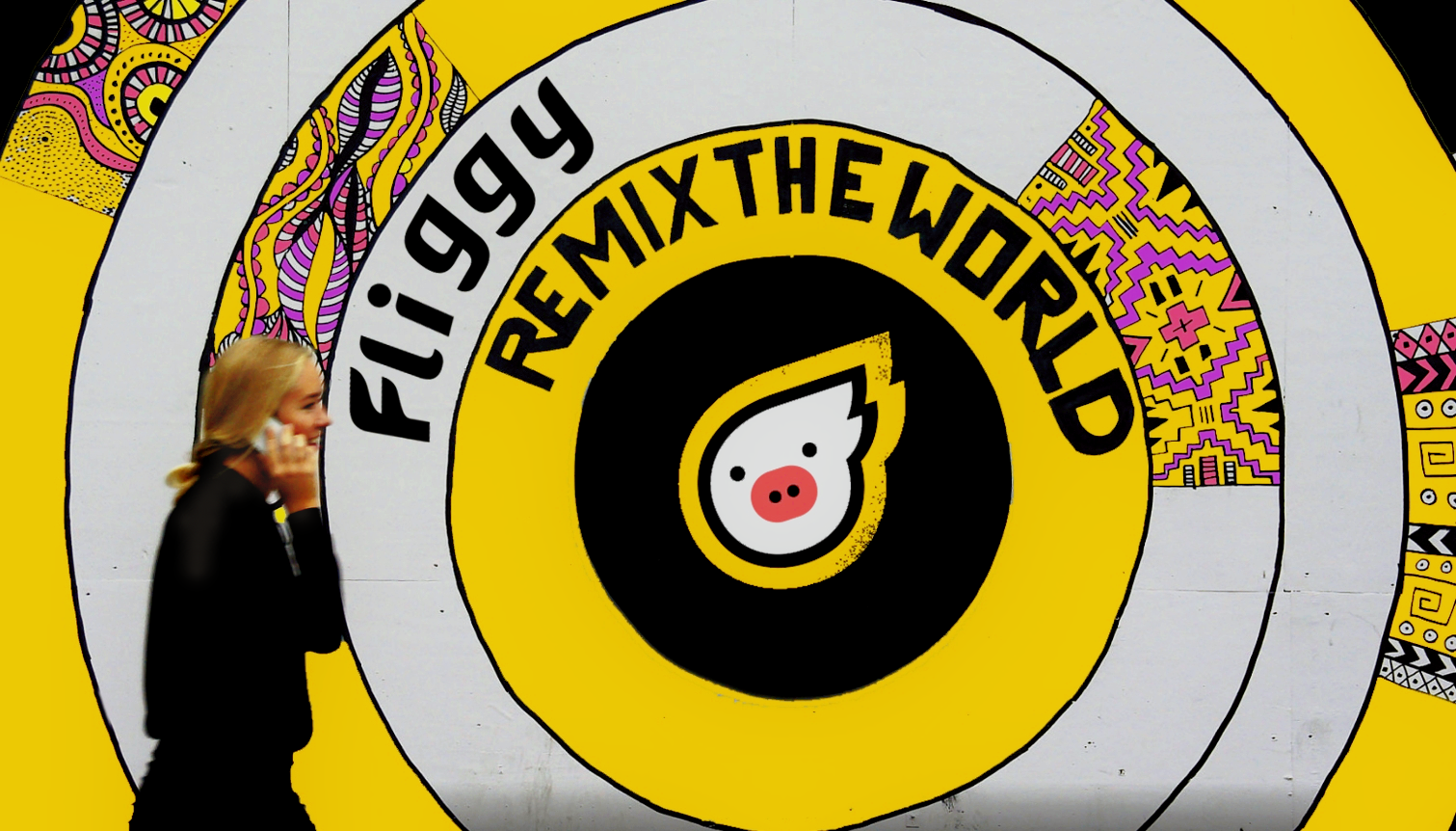
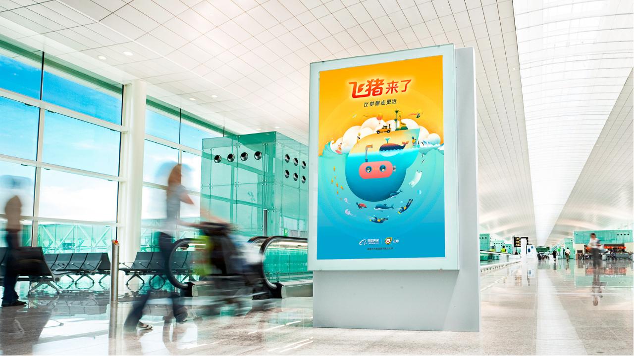
Fliggy key visual
Fliggy key visual

Results

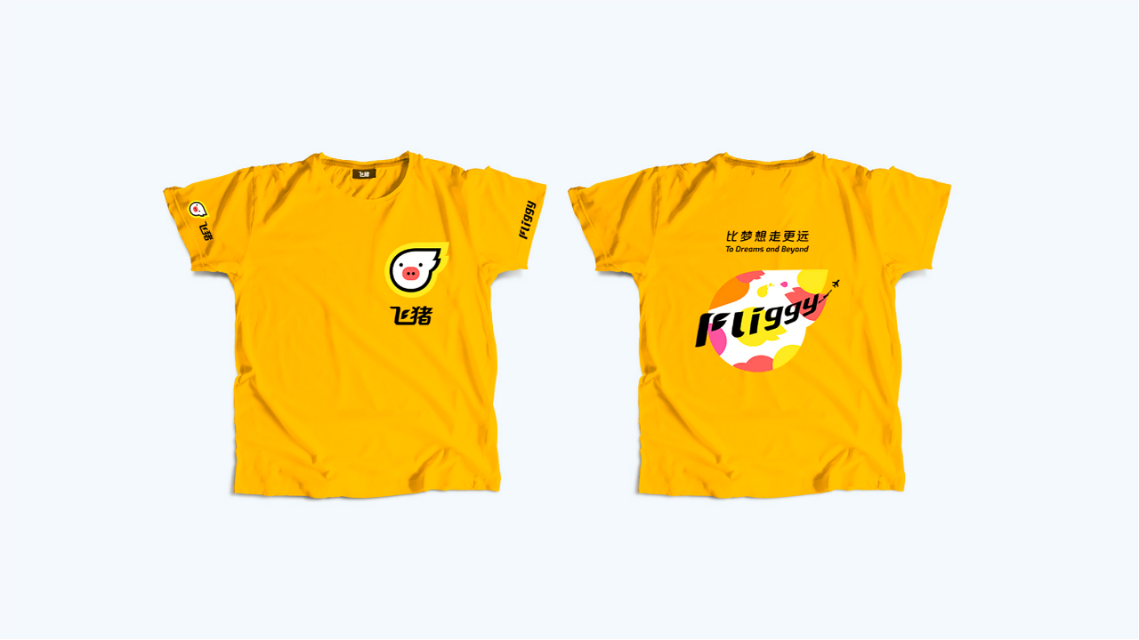
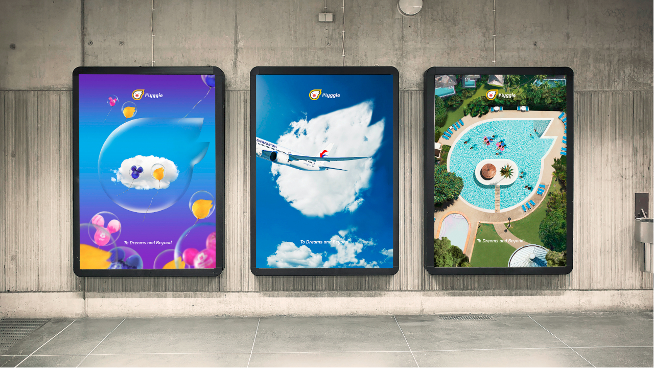
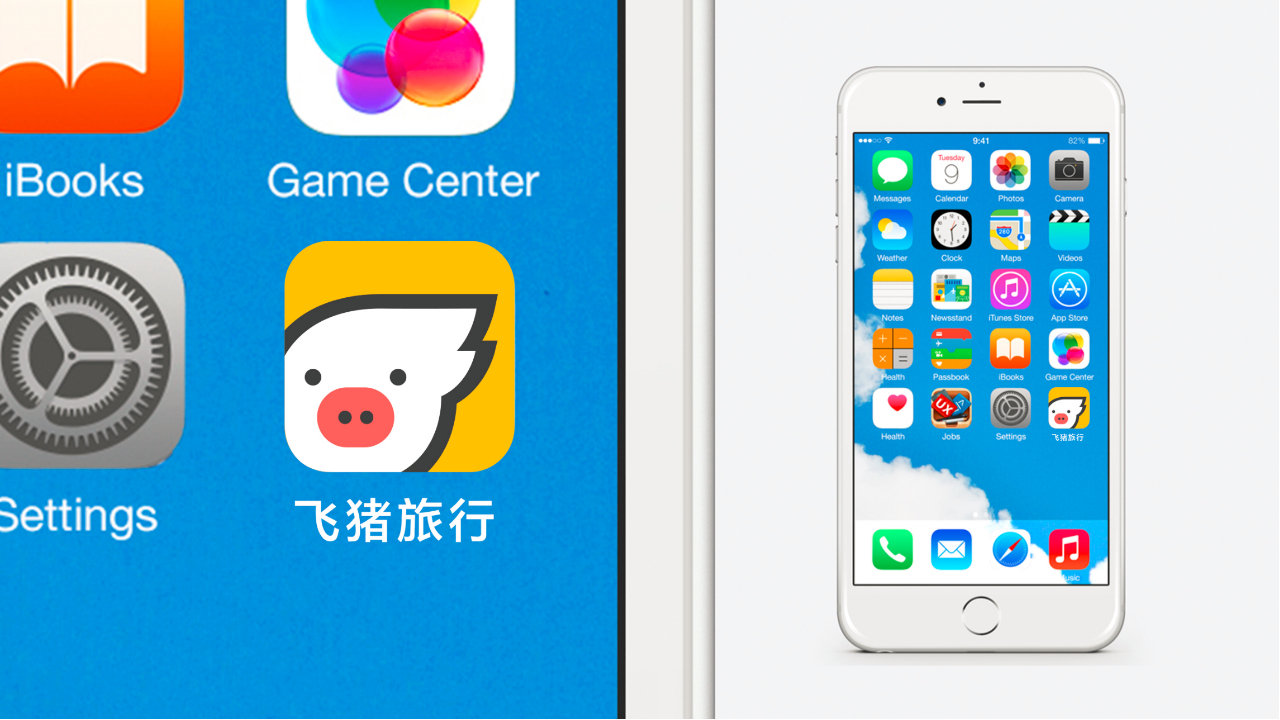
The Fliggy brand identity created by Labbrand successfully conveyed a sense of freedom, happiness, and adventure. The logo design, inspired by comic aesthetics and Pop Art, appealed to the younger generation, while the warm color palette represented their passion for life. The versatile and adaptable design allowed for integration with various marketing and co-branding campaigns. In addition to the brand logo and visual identity system, Labbrand developed a range of visual applications, including a brand book, key visuals, co-branding posters, icons, app applications, mascots, and merchandise such as T-shirts.
Fliggy Brand Identity Creation and VI Design
Fliggy App VI Design
Fliggy Brand Identity Creation and VI Design
Fliggy Brand Identity Creation

The newly crafted Fliggy brand identity carved out a distinct niche within the OTA market, effectively captivating millennials and advancing its ambition to be a premier choice for travel planning.

This transformative project showcased Labbrand’s mastery in conceiving captivating and distinctive brand images, ultimately propelling Fliggy’s emergence as a noteworthy contender within China’s fiercely competitive OTA landscape.
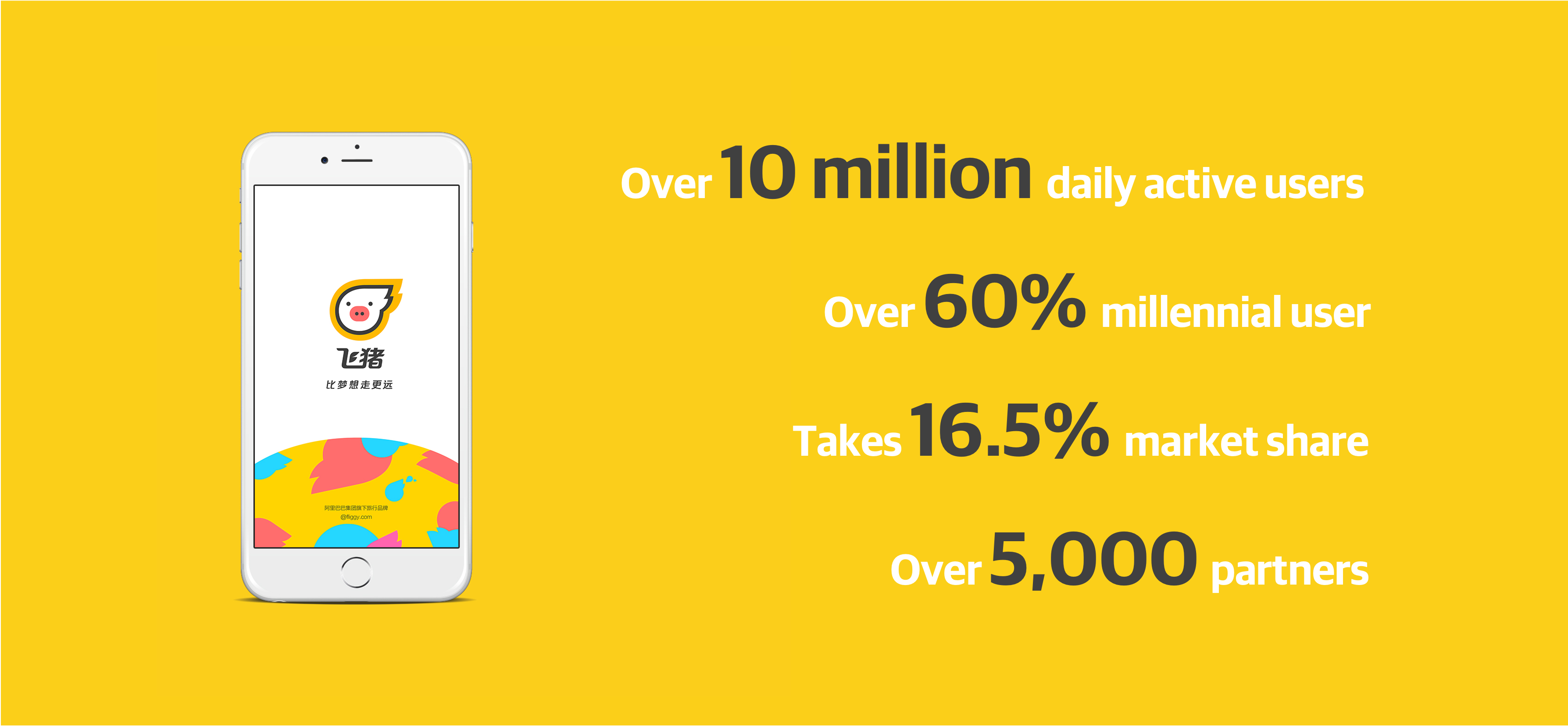
Fliggy Branding
  • SHARE
  • 
  • 
  • 
  • 
BACK

Sign up for our newsletter to get the latest insights, tips, and trends in branding, naming and innovation.

Related Article




Sprite Beverage Packaging Design with a New Visual Identify System

SPRITE is one of China’s leading brands. To further enhance the connection and relevance with a new generation of consumers today, Labbrand was invited to conceptualize a…

Lanvin Group Rebranding Strategy and Brand Identity Transformation

Lanvin Group – the global luxury fashion group formerly known as Fosun Fashion Group – has officially unveiled its new brand identity that represents the Group’s intent t…

Coquille Chinese Brand Name

In the context of Cologne Chinese brand naming, Labbrand elevates the visual identity of Coquille, skillfully infusing sophistication and femininity into the brand for a …

Branded Storytelling: A Powerful Articulation of The Refreshed Brand Identity

Known for its bold, contemporary designs, Wolf & Byrd is a luxury womenswear brand in Singapore that offers a harmonious blend of timeless designs and versatile piece…

Wall’s Brand Naming in Chinese

Experience the artistry of Labbrand in brand naming in Chinese, exemplified by the playful and endearing name 麦酷狮 [mài kù shī] for Max, both the brand and its beloved mas…

DISTRIGO Alphabetic Name Creation and Visual Identity Design

Labbrand helped Groupe PSA with the alphabetic name creation and visual identity design for the brand DISTRIGO. Groupe PSA is the leader in both the construction of excel…

Brand Localization for Petit Bateau: Crafting a Unique Voice with Relevance

Background Petit Bateau is a French fashion house of quality clothing and underwear for children that dates back to 1893. The brand is known for its timeless French …

Sprite Packaging Design

Labbrand created the new product variant packaging and wordmark design for SPRITE Juice with its first flavor variant ICY Coconut. BACKGROUND SPRITE China …

Ready to take your brand to new heights?

Let's start a conversation.
  • NEWSLETTER
  • CAREERS
  • PRIVACY POLICY
  • Labbrand Group
  • Labbrand
  • Madjor
  • SpringPillar

* Will be used in accordance with our Privacy Policy

A Labbrand Group Company © 2005-2025 Labbrand All rights reserved

沪ICP备17001253号-3
  • Follow us:
  • 
  • 
  • 
  • 
  • 
  • 

Contact us to get the latest insights, tips, and trends in branding, naming, and innovation.

* Will be used in accordance with our Privacy Policy

Cookie Notice

To improve your experience, we use cookies to provide social media features, offer you content that targets your particular interests, and analyse the performance of our advertising campaigns. By clicking on “Accept” you consent to all cookies. You also have the option to click “Reject” to limit the use of certain types of cookies. Please be aware that rejecting cookies may affect your website browsing experience and limit the use of some personalised features.

Accept Reject