Search for content of interest

  • About
  • ServiceS
    • Branding
    • Innovation
    • Naming
    • Strategy
    • Research
    • Design
  • Work
  • Insights
  • News
  • LOCATIONS
    • Shanghai
    • Paris
    • New York
    • Singapore
    • Malaysia

CN FR
  • About
  • ServiceS
    • Branding
    • Innovation
    • Naming
    • Strategy
    • Research
    • Design
  • Work
  • Insights
  • News
  • LOCATIONS
    • Shanghai
    • Paris
    • New York
    • Singapore
    • Malaysia
CONTACT

EN

  • CN
  • FR

Home Our Work Detail

EXPERTISE

  • Innovation
  • Strategy
  • Research
  • Design
  • Branding

INDUSTRY

  • Healthcare & Pharma
Contact Us

BeiGene Corporate Identity System Upgrade: Brand Refresh to Accelerate Global Expansion

Aligning Brand with Strategy From Research-Driven to Global Influence

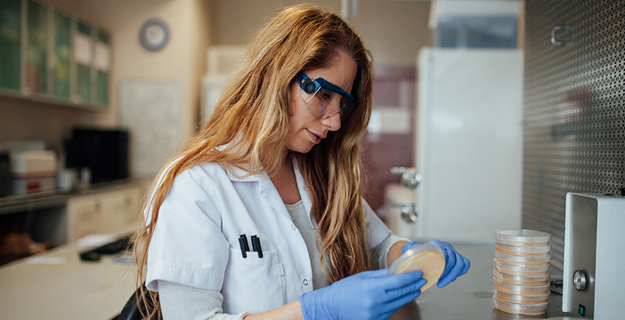
As a leading global biopharmaceutical innovator, BeiGene has been committed since its founding to making medicines more affordable and accessible for patients worldwide, while achieving remarkable breakthroughs in oncology. Yet, as its global expansion accelerates, the existing brand identity system has reached its limits in supporting broader communication needs—it requires refinement to better convey the company’s science-driven spirit of innovation and to engage effectively with diverse global stakeholders.

At this strategic stage, BeiGene partnered with international brand consultancy LABBRAND to launch a comprehensive brand identity optimization initiative. The project is designed to create a unified, professional, and modern brand language that strengthens international recognition and trust, while cementing BeiGene’s position as a global leader in life sciences.

Anchoring Consistency to Unlock Brand Power

In this collaboration, LABBRAND leveraged our brand power model across three critical dimensions, guiding BeiGene through a holistic review of its brand identity and expression system:

  • Leadership: advancing from BeiGene’s origins as a pioneering R&D company in China to becoming recognized worldwide as a benchmark for scientific innovation among patients, physicians, investors, and partners.
  • Experience: crafting a visual identity that seamlessly bridges scientific authority with human warmth, translating innovation effortlessly from the laboratory into clinical practice.
  • Influence: creating a unified and distinctive visual language that strengthens BeiGene’s connections across the global pharmaceutical ecosystem.

Anchored in strategic clarity, LABBRAND led a holistic upgrade across visual, verbal, and cultural dimensions. We crafted a blue-to-red gradient that reflects BeiGene’s dual DNA—technological rigor and Chinese heritage—strengthening the brand identity system’s adaptability, inclusivity, and resonance on the global stage.

End-to-End and Design-Drive From Research Insights to Visual Implementation

BeiGene’s corporate identity system upgrade followed a comprehensive process of “DISCOVERY–INCLUSION–DEFINITION–CREATION–VALIDATION–REFINE–GUIDE.” At every stage, LABBRAND teams engaged deeply through internal brand interviews, external research, design co-creation, and validation.

The journey began with in-depth interviews and design thinking workshops to uncover the real gaps between BeiGene’s strategy, culture, and brand expression. Benchmarking against leading global pharmaceutical brands then enabled the team to define BeiGene’s distinctive visual identity strategy. Building on this foundation, LABBRAND created a brand color system centered on Tech Blue and Chinese Red, together with a cohesive visual language and graphic system. Fine line elements were introduced to symbolize scientific precision and progressive vision—shaping a brand image that harmonizes modernity with scientific spirit.

The deliverables went beyond an optimized logo, encompassing a comprehensive visual guidelines manual and recommendations for global promotional materials. This ensures consistency, scalability, and effective execution of the brand identity across all global touchpoints.

Global Brand Identity Refresh Toward a More Resonant Brand Communication System

BeiGene’s brand optimization has established a highly consistent, professional, trustworthy, and culturally resonant brand expression system, enabling it to demonstrate stronger brand recognition and resonance on the international stage. The updated corporate image not only enhances compliance and efficiency in global registration and communication but also better supports its brand proposition of “science-driven, human-centric,” empowering BeiGene to leverage brand strength to unlock greater business growth potential.

  • SHARE
  • 
  • 
  • 
  • 
BACK

Sign up for our newsletter to get the latest insights, tips, and trends in branding, naming and innovation.

Related Article




Enriching the Brand Equity for Arla Baby & Me

Arla Baby & Me, a premium offering in the Chinese market, embarked on a strategic initiative to revitalize its brand and create synergy across its product lines, incl…

Supporting Bluepha’s Ongoing Brand Enhancement

Background Bluepha, established in 2016, specializes in designing, developing, manufacturing, and marketing novel bio-based molecules and materials, with its biodegradabl…

Defining the Brand and Experience of Hilton Maldives Amingiri Resort & Spa

Nestled amidst tranquil blue waters of North Malé, Hilton Maldives Amingiri Resort & Spa represents the flagship debut of Hilton Hotels & Resorts (HHR) brand in M…

Kinder Tronky Chinese Brand Name Creation

For a foreign brand to succeed in the Chinese market, an ideal Chinese brand name creation is key. Labbrand creates the brand name 健达轻脆怡 [jiàn dá qīng cuì yí] for Kinder …

Alphabetic Naming – LAMANDO Alphabetic Brand Name Creation

Unlock the art of alphabetic naming with Labbrand's success story in crafting the dynamic name "LAMANDO" for Volkswagen's latest car model. Experience the fusion of energ…

MAXI-COSI Global Multi-Channel Ad Campaign

Labbrand collaborated with MAXI-COSI to create a global multi-channel ad campaign for their new Wheely stroller. The campaign aimed to communicate the brand’s positioning…

Creating Key Visuals and Brand Design Strategy for Rheinmetall

LABBRAND delivered Rheinmetall Automotive 4 new key visualization concept and brand design strategy. Brand Design Strategy: TECHNOLOGIES FOR MOBILITY Rheinmetall Automoti…

Airbnb Brand Localization: Creating a Unique Chinese Brand Name and Visual Identity

In the competitive Chinese market, Airbnb faced challenges in successfully establishing its brand and conveying its travel philosophy to local consumers. Labbrand, levera…

Ready to take your brand to new heights?

Let's start a conversation.
  • NEWSLETTER
  • CAREERS
  • PRIVACY POLICY
  • Labbrand Group
  • Labbrand
  • Madjor
  • SpringPillar

* Will be used in accordance with our Privacy Policy

A Labbrand Group Company © 2005-2025 Labbrand All rights reserved

沪ICP备17001253号-3
  • Follow us:
  • 
  • 
  • 
  • 
  • 
  • 

Contact us to get the latest insights, tips, and trends in branding, naming, and innovation.

* Will be used in accordance with our Privacy Policy

Cookie Notice

To improve your experience, we use cookies to provide social media features, offer you content that targets your particular interests, and analyse the performance of our advertising campaigns. By clicking on “Accept” you consent to all cookies. You also have the option to click “Reject” to limit the use of certain types of cookies. Please be aware that rejecting cookies may affect your website browsing experience and limit the use of some personalised features.

Accept Reject