Search for content of interest

  • About
  • ServiceS
    • Branding
    • Innovation
    • Naming
    • Strategy
    • Research
    • Design
  • Work
  • Insights
  • News
  • LOCATIONS
    • Shanghai
    • Paris
    • New York
    • Singapore
    • Kuala Lumpur

CN FR
  • About
  • ServiceS
    • Branding
    • Innovation
    • Naming
    • Strategy
    • Research
    • Design
  • Work
  • Insights
  • News
  • LOCATIONS
    • Shanghai
    • Paris
    • New York
    • Singapore
    • Kuala Lumpur
CONTACT

EN

  • CN
  • FR

Home Our Work Detail

EXPERTISE

  • Strategy
  • Design

INDUSTRY

  • Electronics & Appliances
Contact Us

Axent Chinese Website: Axent Brand Website Creation

Axent Chinese Website – INNOVATE DNA WITH SWISS HERITAGE

Discover the answer with Axent Chinese Website – a strategic move by a local OEM in the intricate landscape of China. Navigating complexities, Axent aims to build a strong brand that stands out amidst well-established players. Explore the journey of proposing something new and memorable in the competitive Chinese market.

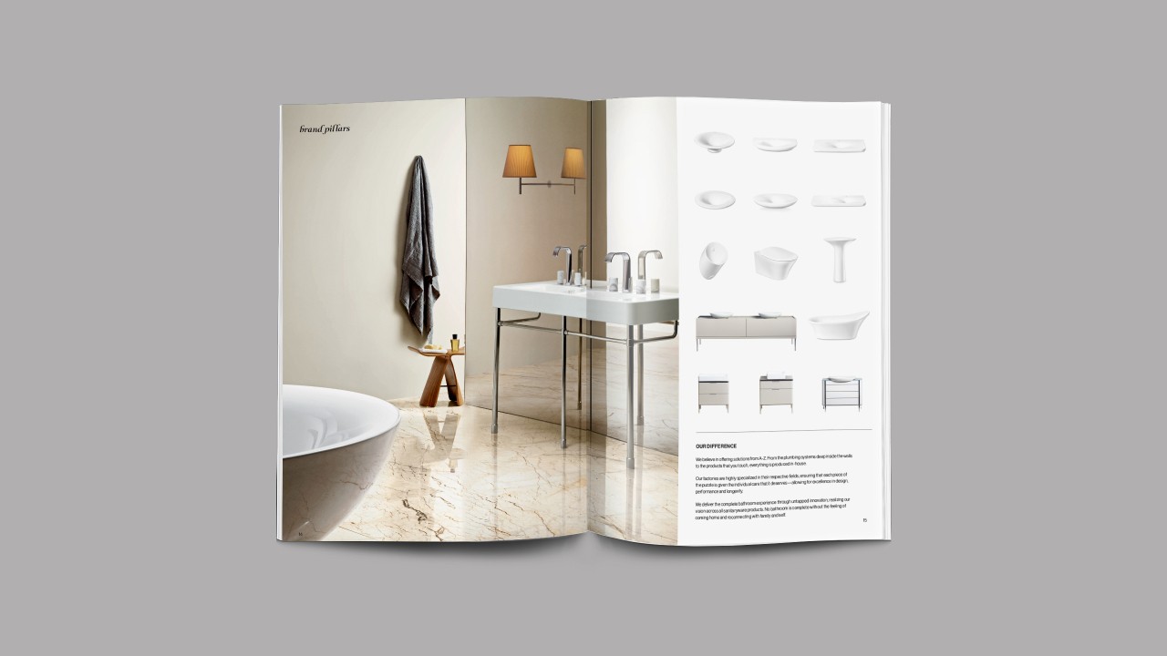
AXENT knows about this challenge firsthand. Born from an OEM model, AXENT combines its innovative Chinese DNA with a strong Swiss heritage. It produces and delivers the complete bathroom, integrating nature, human behavior, intuition, wellbeing, and health into their promise.

Axent Chinese Website – THE BIGGER PICTURE

Deriving from a simple, tactical request – revamping AXENT’s website for China – Labbrand managed to frame the client’s needs into a bigger picture:

How do we define this brand? Which brand concepts should the website design convey? What is the brand experience going to be?

MANIFESTING PERFECTION THROUGH SIMPLICITY

We arrived at this powerful statement, that expresses the vision that AXENT would be the brand that represents the level of perfection that is only present in nature. This is true to AXENT’s essence: delivering simple yet intuitive products thanks to its deep understanding of human needs.

The website structure links back to this, as it is built for intuitive navigation: the experience and information organization is different for an architect, property manager or an individual looking to remodel their bathroom.

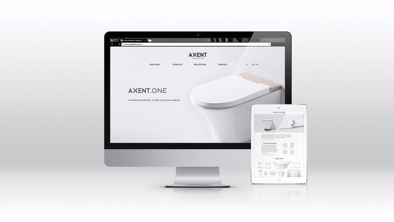
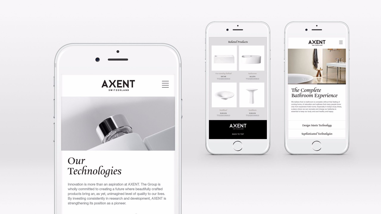
The dual cultural identity influenced the design strategy as well, materializing in key visual elements. We picked two complementary fonts: one that could mirror a humanistic renaissance feel, and one to convey geometrical precision. The brand colors go from black and white = simplicity, to warm greys = nature and cold greys = technology.

These elements altogether reflect AXENT’s identity: China and Switzerland, industrial and nature, technological while human.

RETHINKING THE BATH

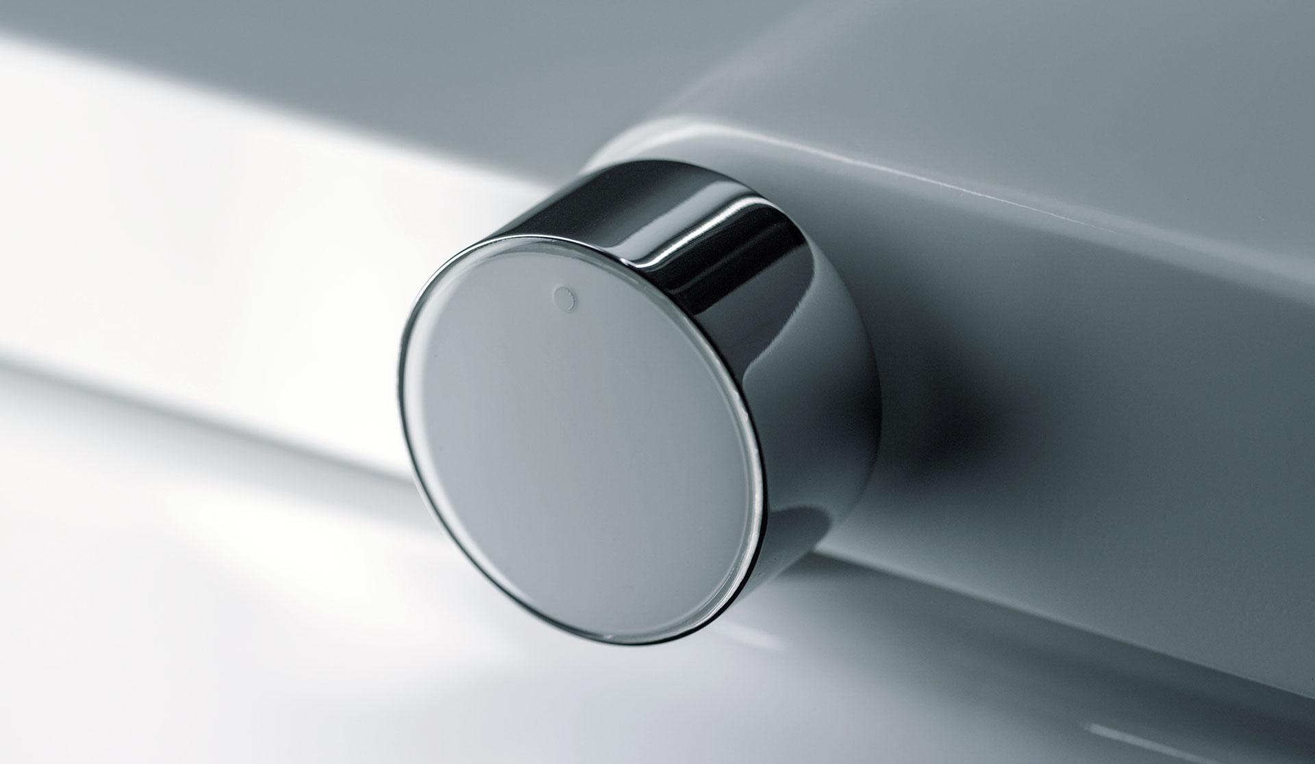
Beyond the visual decisions required for the new website, we continued to work with AXENT to create a visual language that could transcend online channels but to all communication in showrooms, brochures and internally, across stakeholders and partners. We developed illustration styles for them to provide technical drawings for each product; we redesigned their iconography system for consumers to operate the products; we redefined their photography style to convey their identity when shooting products.

These strategic and visual assets were then consolidated into a Brand Book that could be handed out, sent and read to relevant audiences, sharing the story of the brand while guiding its evolution on communication and visual levels.

  • Working with such a professional team has been an inspiration throughout the entire project, and beyond.

    Imke Kastka

    Digital Content Manager

  • “Labbrand’s passionate team has helped us to not only launch a powerful website that is true to our brand philosophy, easy to navigate and simply breathtakingly beautiful; but also we worked together to develop a differentiating identity for our brand.”

    Imke Kastka

    Digital Content Manager

  • SHARE
  • 
  • 
  • 
  • 
BACK

Sign up for our newsletter to get the latest insights, tips, and trends in branding, naming and innovation.

Related Article




Innovation and Market Insight Converge as TePe Redefines Premium Oral Care

TePe, a professional oral care brand from Sweden, boasts over 60 years of R&D expertise and has established a leading position in the European market, earning widespr…

Lancôme – Unveiling Sustainable Luxury Through Grasse Storytelling

Background  Lancôme purchased the Domaine De La Rose estate in Grasse in 2020 to create sustainable products for their new range of fragrances, which aligned with th…

How Labbrand created the product nickname for Nespresso’s iconic coffee machine

Summary Labbrand successfully developed memorable and meaningful Chinese product naming for Nespresso's capsules and Lattissima One coffee machine. By leveraging creative…

Supporting Bluepha’s Ongoing Brand Enhancement

Background Bluepha, established in 2016, specializes in designing, developing, manufacturing, and marketing novel bio-based molecules and materials, with its biodegradabl…

Local Market Research: Bebelac Brand Territory And Research Testing

Explore the realms of local market research as we delve into Danone's strategic journey. In 2017, Danone revealed a refreshed logo and its inaugural company signature: "O…

Tailoring a Singapore Icon for China: Parkway’s Brand Strategy Localization at 20 Years

Leading High-End Healthcare for Two Decades, Embracing a New Era of Localization Parkway Shanghai, as one of the first international medical institutions in China, has be…

Leo Brand Repositioning Strategy

The brand repositioning strategy by Labbrand for Leo allows Leo to blossom into the leading brand of snacks worldwide. Brand Repositioning Strategy - LEADING THE SNACK WO…

Kinder Tronky Chinese Brand Name Creation

For a foreign brand to succeed in the Chinese market, an ideal Chinese brand name creation is key. Labbrand creates the brand name 健达轻脆怡 [jiàn dá qīng cuì yí] for Kinder …

Ready to take your brand to new heights?

Let's start a conversation.
  • NEWSLETTER
  • CAREERS
  • PRIVACY POLICY
  • Labbrand Group
  • Labbrand
  • Madjor
  • SpringPillar

* Will be used in accordance with our Privacy Policy

A Labbrand Group Company © 2005-2025 Labbrand All rights reserved

沪ICP备17001253号-3
  • Follow us:
  • 
  • 
  • 
  • 
  • 
  • 

Contact us to get the latest insights, tips, and trends in branding, naming, and innovation.

* Will be used in accordance with our Privacy Policy

Cookie Notice

To improve your experience, we use cookies to provide social media features, offer you content that targets your particular interests, and analyse the performance of our advertising campaigns. By clicking on “Accept” you consent to all cookies. You also have the option to click “Reject” to limit the use of certain types of cookies. Please be aware that rejecting cookies may affect your website browsing experience and limit the use of some personalised features.

Accept Reject