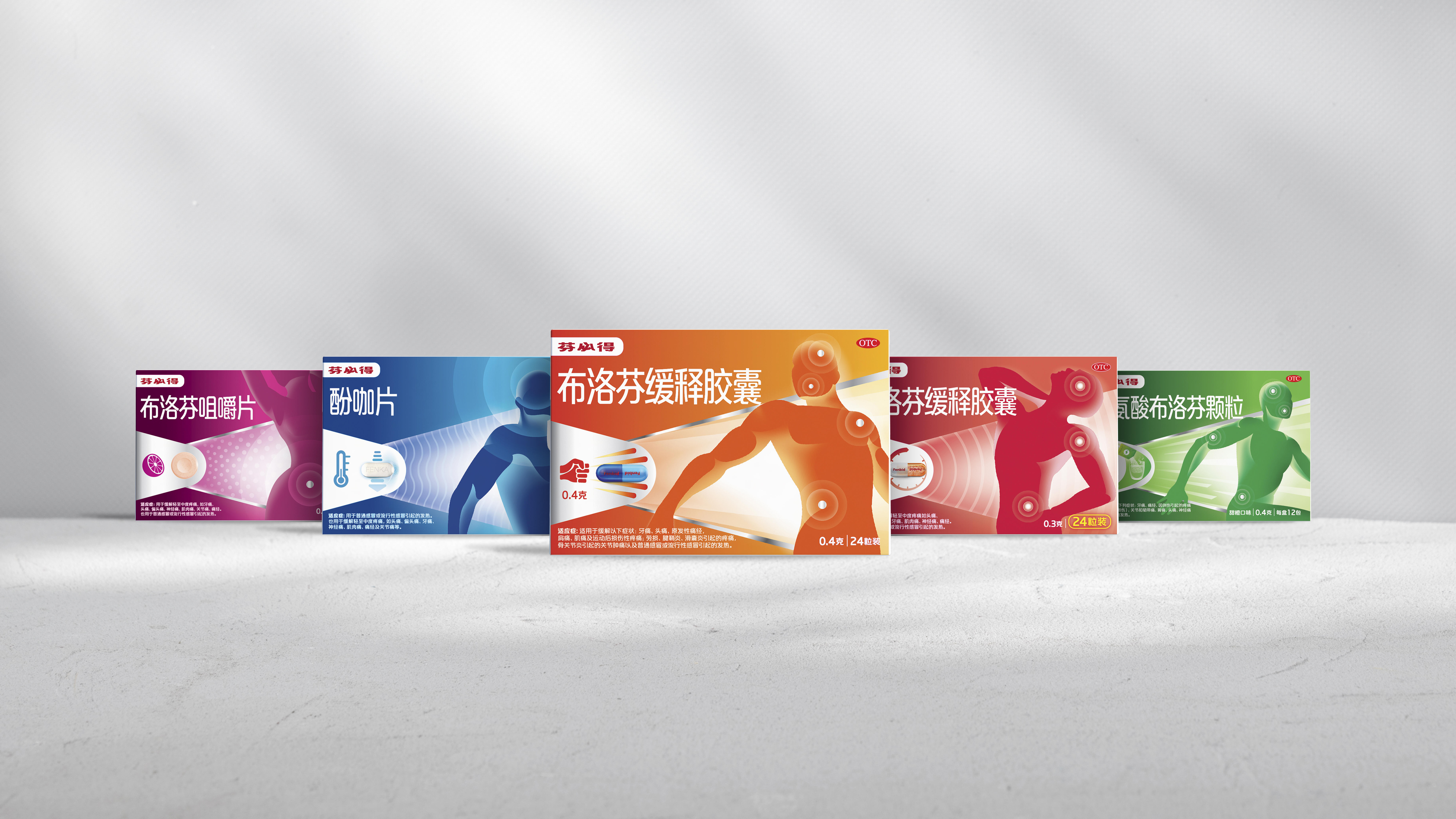
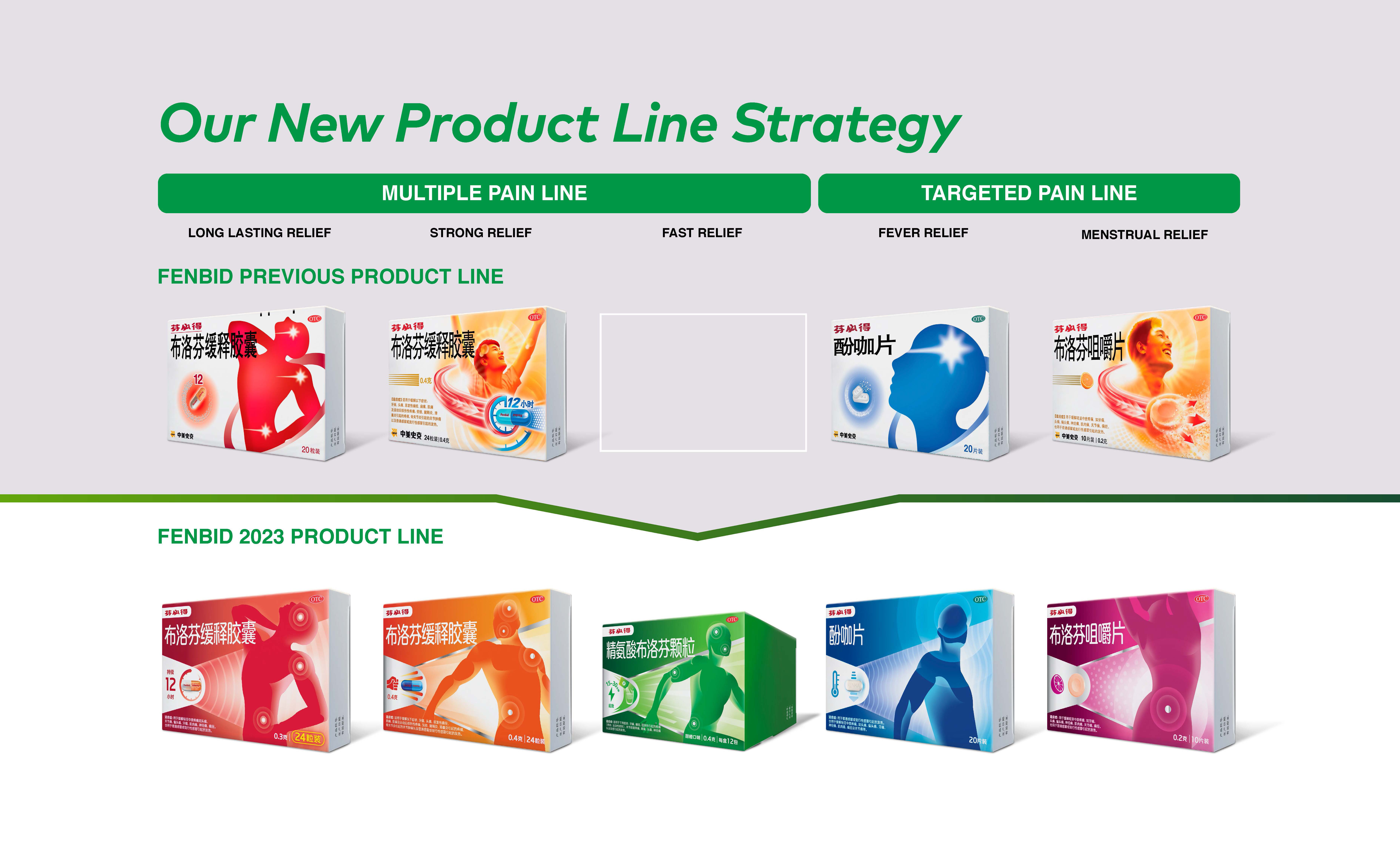
GSK Fenbid holds a dominant position as the leader in the Oral OTC pain subcategory and ranks third in the broader pain relief category. To further solidify its brand presence in the Chinese market, Labbrand meticulously crafted a unified Visual Brand Language for Fenbid. This strategic move enhances the brand’s visibility, ensuring a seamless and distinct presence across its various product ranges and variants. Additionally, this harmonized visual identity fosters a clear differentiation against competitors, contributing to both brand coherence and distinctiveness.
Despite its current success, Fenbid still possesses untapped potential for further growth. However, within the market landscape it faces many challenges. One such challenge is the continued prevalence of imitation brands, which pose a threat to Fenbid’s market position. Moreover, the general perception that all Ibuprofen products are the same, needs to be addressed. These challenges underscore the need for strategic initiatives to maintain Fenbid’s competitive edge and solidify its market position as the Pain Management Expert.
Labbrand undertook the task of developing a consolidated Visual Brand Language for Fenbid in China. The objective was to create a coherent and differentiated brand identity across Fenbid’s product ranges and variants, while also standing out against competition.
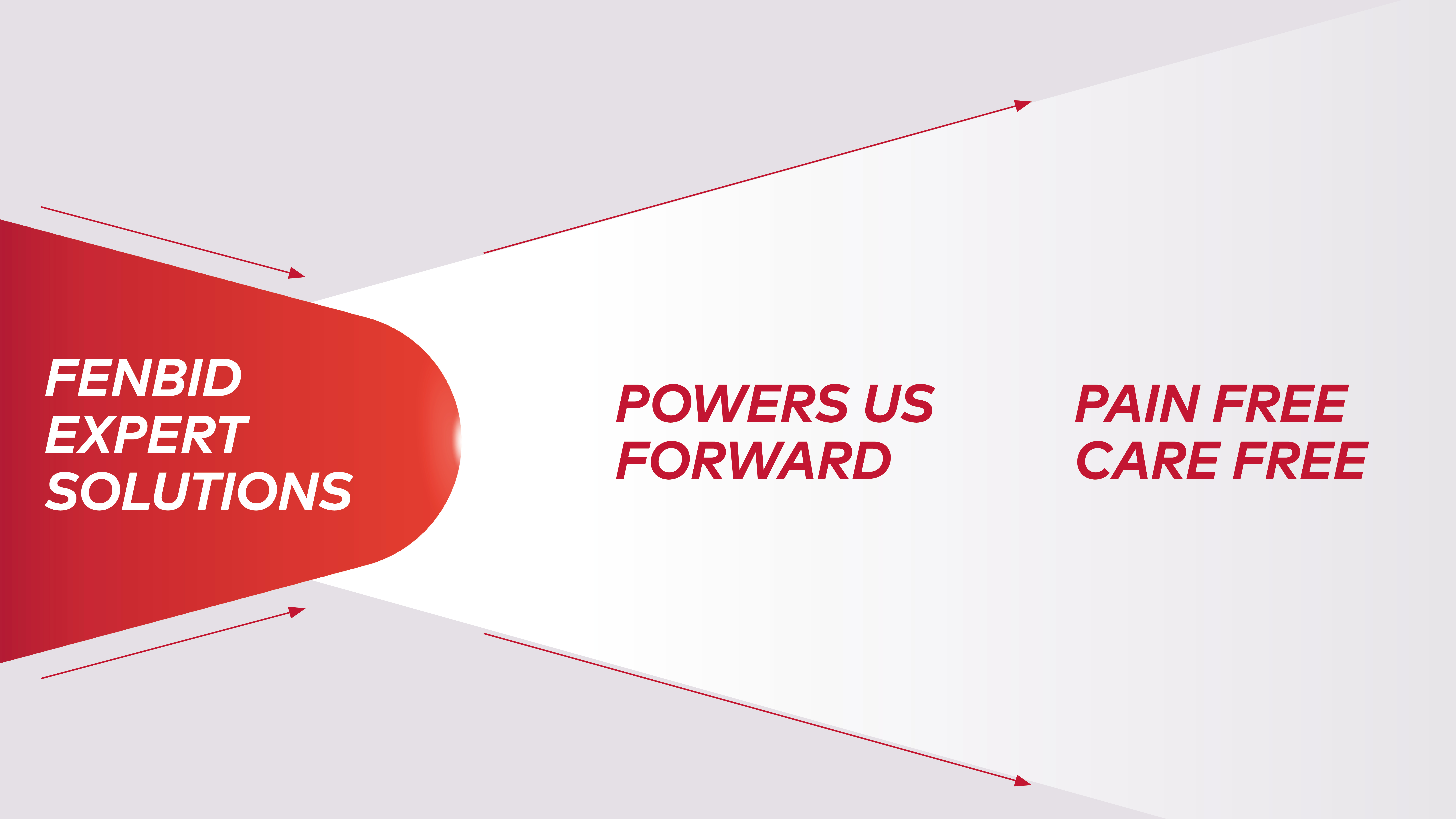
Labbrand shifted the role of the brand mascot, “the red man,” to embody the new brand heart and a state of wellness, conveying the message of “Power Us Forward, Leaving Pain Behind”.
We also developed a new brand heart device that directly embodies the brand heart as the key brand equity featured across the entire Fenbid Brand Rejuvenation.

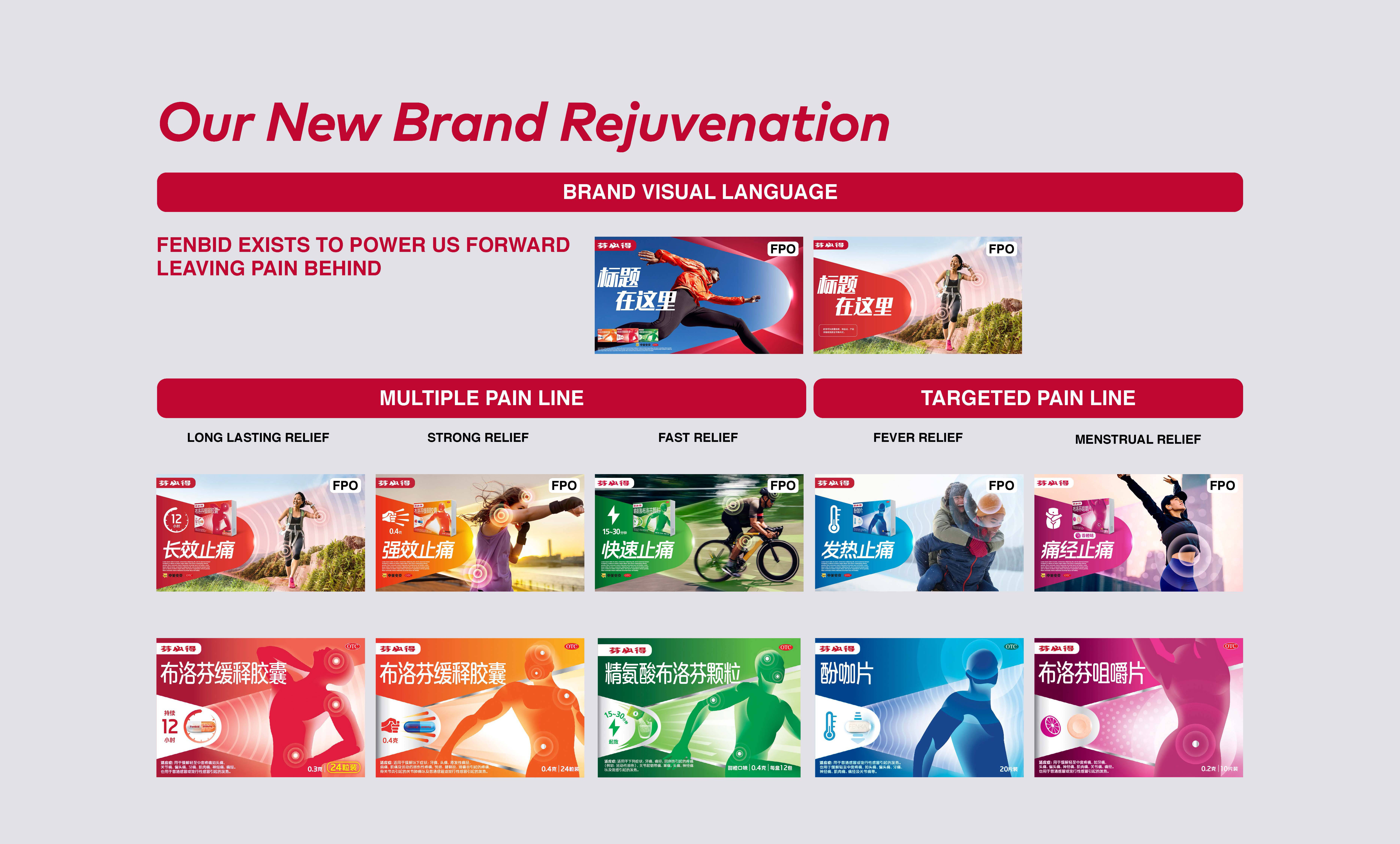
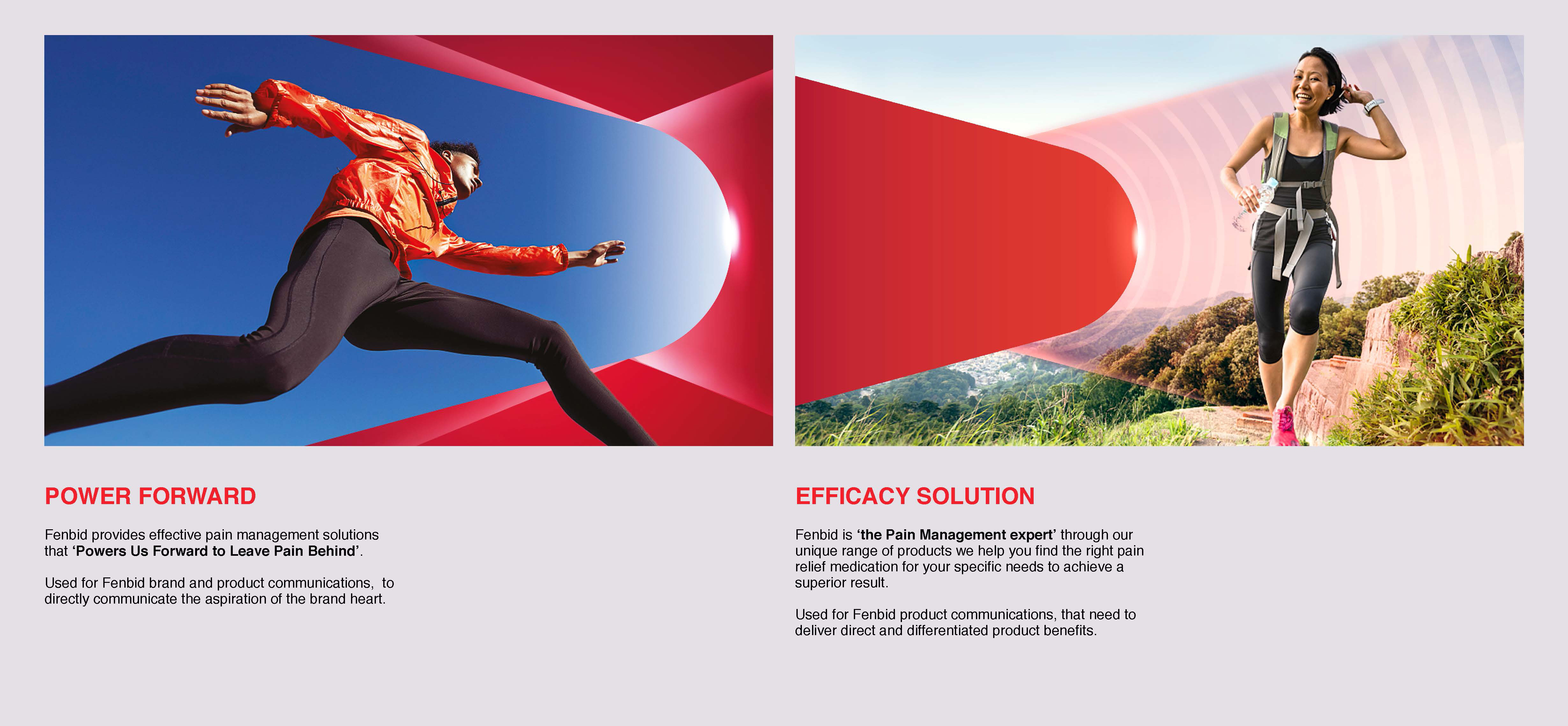
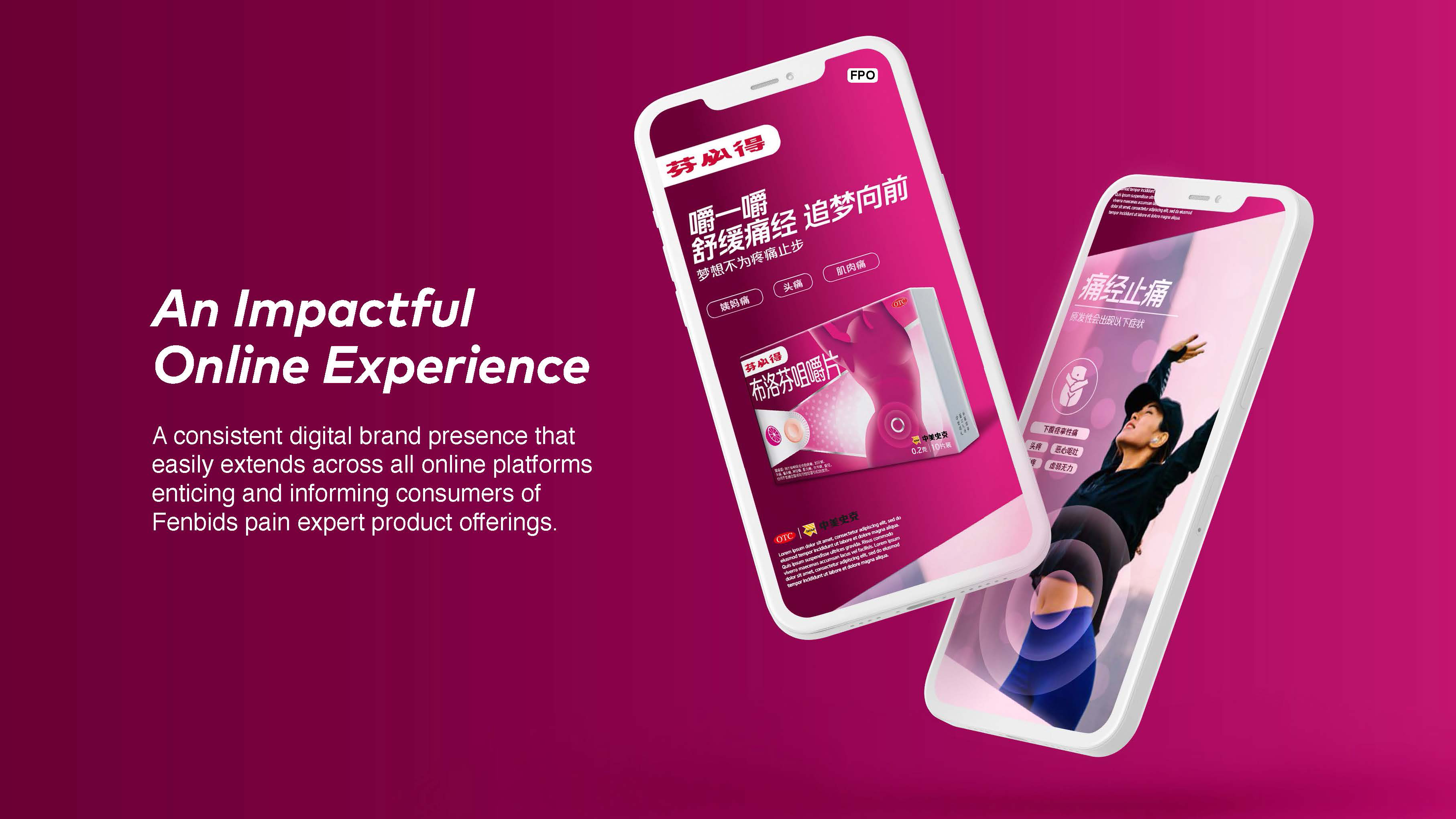
Two distinct visual languages were created: “POWER FORWARD” for the brand’s aspiration and “EFFICACY SOLUTION” for product communications. These languages were applied across brand and product communications to deliver a clear and consistent message.
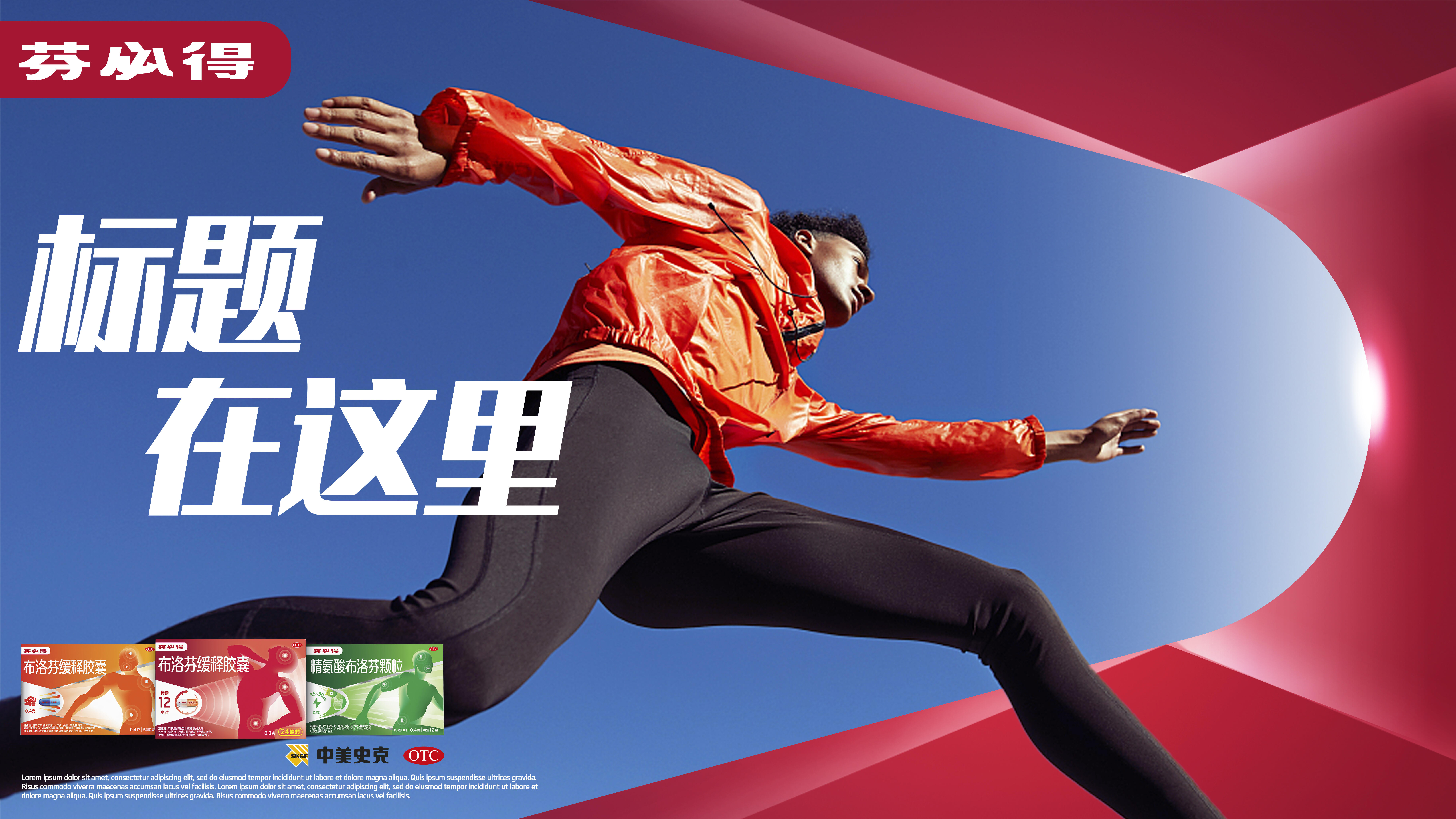
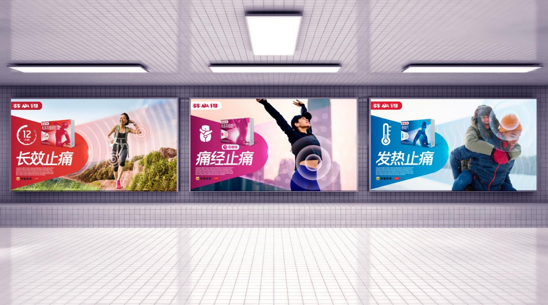
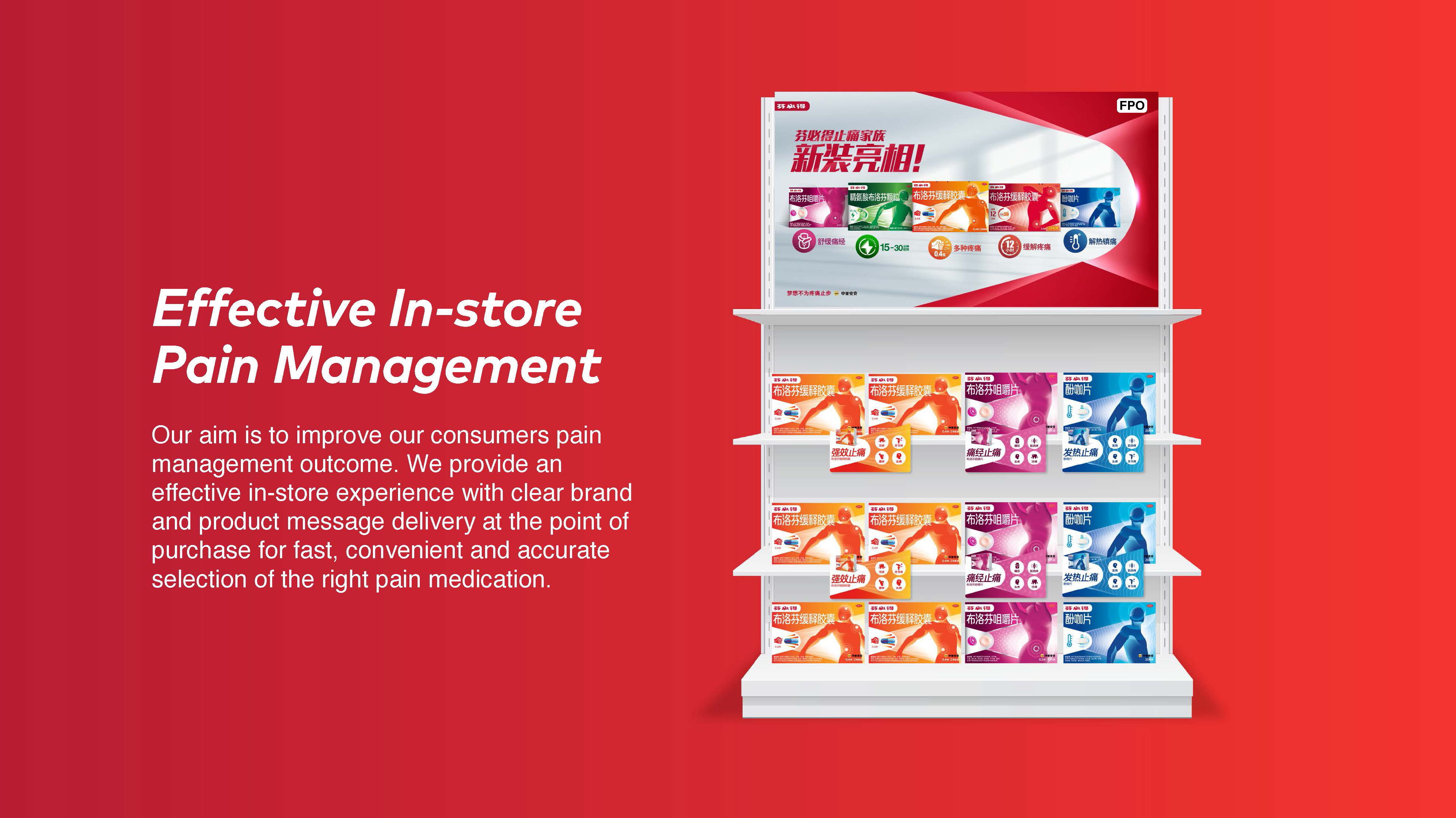
The hero image of each product can be differentiated by the different product devices and colours for a clear and consistent visual system allowing for convenient identification and navigation across Fenbid’s key touchpoints, improving consumers pain management journey by enabling them to find the right pain medication for their pain relief needs.
The unified brand identity has had a profound impact on Fenbid’s visibility and distinctiveness. It has successfully set apart Fenbid’s products from its own diverse ranges and variations, as well as from competitors in the market. This differentiation has not only fostered growth but has also proven invaluable in the intensely competitive landscape.
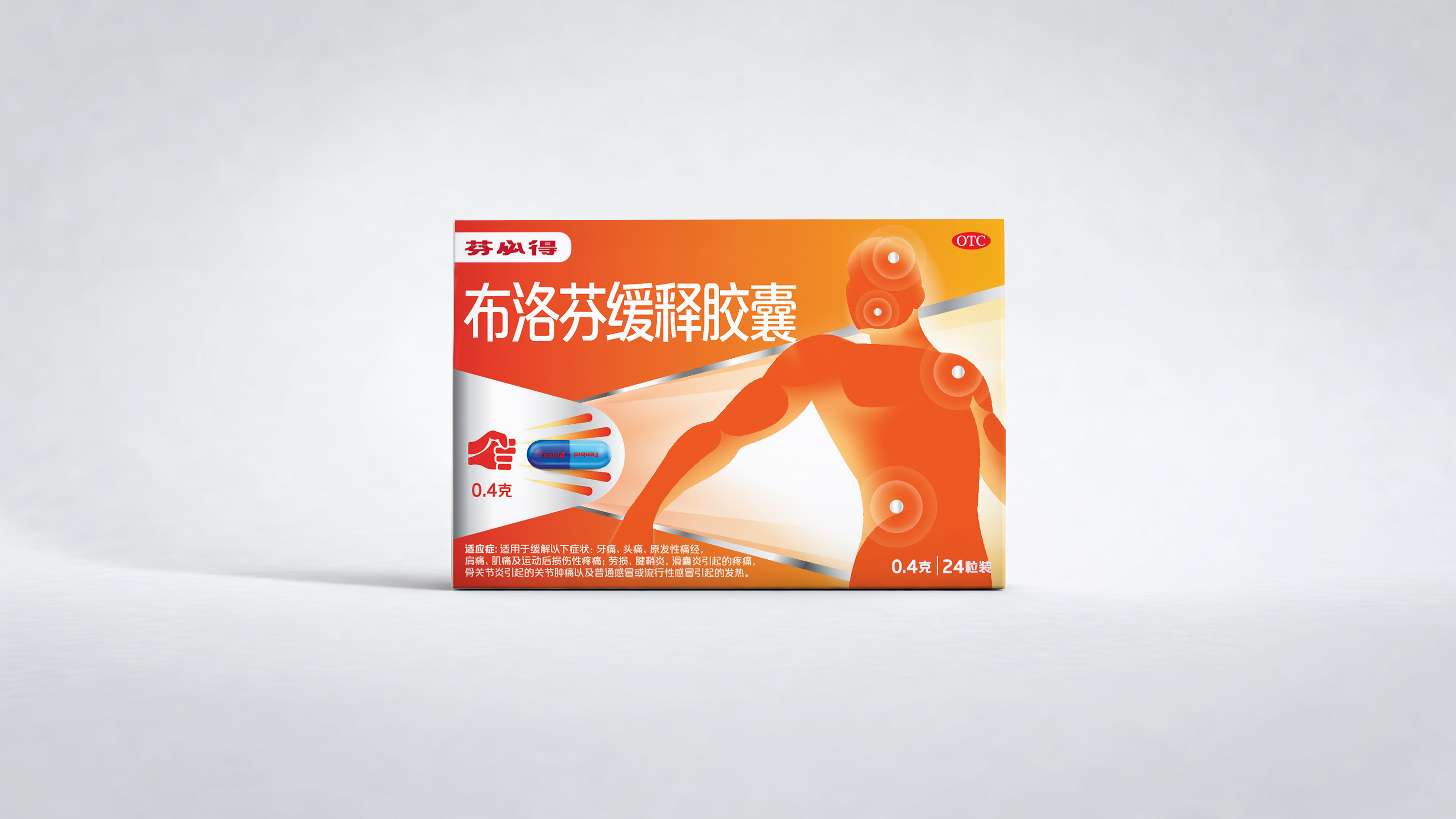
Moreover, the packaging design played a pivotal role in this process. By effectively conveying both functional advantages and creating an emotional connection, it contributed to two important objectives. Firstly, it attracted a larger base of oral OTC consumers seeking treatments. Secondly, it enticed loyal users to elevate their experience through premium offerings. This strategic approach has not only expanded Fenbid’s customer base but has also facilitated the elevation of customer loyalty and perceived value.


To improve your experience, we use cookies to provide social media features, offer you content that targets your particular interests, and analyse the performance of our advertising campaigns. By clicking on “Accept” you consent to all cookies. You also have the option to click “Reject” to limit the use of certain types of cookies. Please be aware that rejecting cookies may affect your website browsing experience and limit the use of some personalised features.