Search for content of interest

  • About
  • ServiceS
    • Branding
    • Innovation
    • Naming
    • Strategy
    • Research
    • Design
  • Work
  • Insights
  • News
  • LOCATIONS
    • Shanghai
    • Paris
    • New York
    • Singapore
    • Kuala Lumpur

CN FR
  • About
  • ServiceS
    • Branding
    • Innovation
    • Naming
    • Strategy
    • Research
    • Design
  • Work
  • Insights
  • News
  • LOCATIONS
    • Shanghai
    • Paris
    • New York
    • Singapore
    • Kuala Lumpur
CONTACT

EN

  • CN
  • FR

Home Our Work Detail

EXPERTISE

  • Strategy
  • Design
  • Branding
  • Innovation

REGION

  • Global
  • APAC

INDUSTRY

  • Tech & Digital
  • Professional & Financial Services
Contact Us

A Little More: Alipay Global Communication Campaign and Visual System Creation

Alipay is a third-party mobile and online payment platform, with over 450 million users. It overtook PayPal as the world’s largest mobile payment platform in 2013. Alipay has developed a global campaign visual system in collaboration with Labbrand in order to encourage users to use Alipay more in their global travels. The creative concept of the visual communication system is “A little more”.

Challenge

Alipay faced the challenge of encouraging users to use their platform while traveling globally. They needed a visual communication system that effectively communicated the concept of “a little more” and conveyed the benefits of using Alipay’s services abroad. 

A Little More: Visual System

Solution

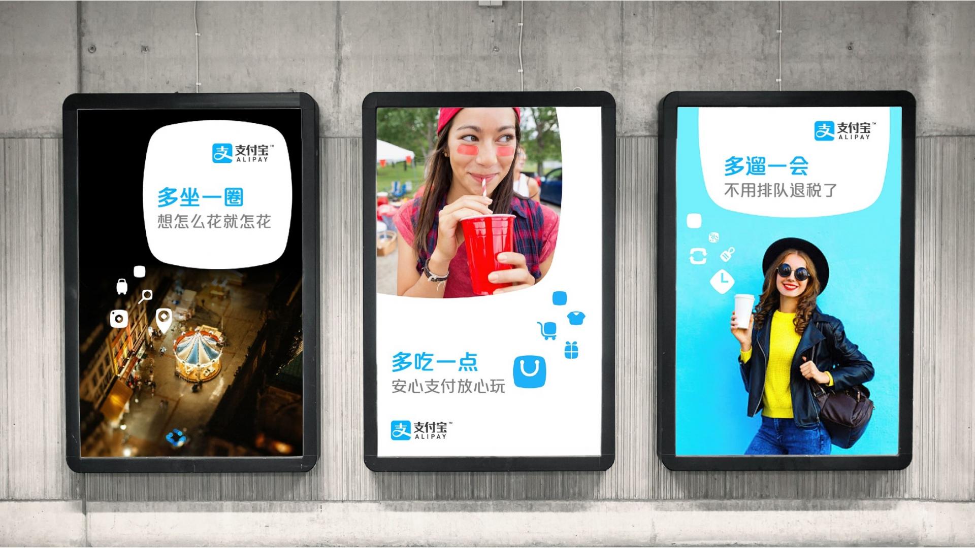
Based on the current brand visual assets, Labbrand designed a set of ownable graphics that can be used in a flexible way, yet smartly illustrate the concept, and convey the joy of travel. A well-thought usage principle is provided to ensure that visual expression can be consistently communicated across the world.

Labbrand created a set of icons to illustrate the 4 core services that Alipay International offers to users, which are easy to be understood, and increases the recognition and understanding of the benefit. This set of icons is well fit for the Alipay worldwide campaign. These symbols can be easily fit into various content and environment of different countries/languages.

Alipay Global Visual Communication System

Results

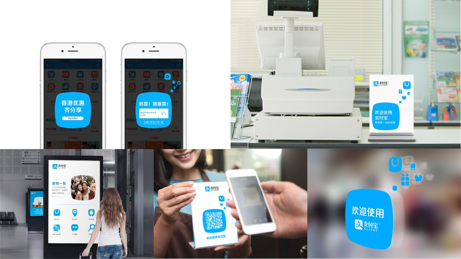
The bold rounded square shape is used as the main element in the campaign visual communication system, and applied flexibly through every touchpoint. It has become a distinctive visual asset of Alipay.

The developed visuals have been launched in over 31 airports around the world.

  • SHARE
  • 
  • 
  • 
  • 
BACK

Sign up for our newsletter to get the latest insights, tips, and trends in branding, naming and innovation.

Related Article




Unilever China Innovation – OMO and Comfort Leading Brand Innovation in the Chinese Fabric Care Market 

Unilever, teaming up with Labbrand, dove into a journey of brand innovation with a focus on brand innovation to bolster its fabric cleaning and conditioning powerhouses, …

Supplyframe Naming: Supplyframe Chinese Brand Name Creation

Unlock the strategic process of Supplyframe naming as Labbrand crafts a Chinese brand name that encapsulates the expansive reach of the supply chain. Delve into the art o…

Reimagining Vita Coco: A Strategic Localization Journey

Since its global debut in 2004, Vita Coco has revolutionized the coconut water category with its promise of natural hydration and wellness. By the time the brand entered …

SkyTeam Brand Identity Strategy

Labbrand successfully creates the Chinese brand identity strategy for SkyTeam and SkyPriority, establishing a caring and luxury value for the brand. Brand Identity Strate…

Creating Key Visuals and Brand Design Strategy for Rheinmetall

LABBRAND delivered Rheinmetall Automotive 4 new key visualization concept and brand design strategy. Brand Design Strategy: TECHNOLOGIES FOR MOBILITY Rheinmetall Automoti…

PepsiCo Chinese Cultural Insights Research

Through an in-depth research, Labbrand helped Pepsi gain cultural insights research of young generation, enables it to better communicate in China. CELEBRATE THE POSSIBIL…

Skoreway Alphabetic Brand Naming

Labbrand’s proficiency in alphabetic brand naming shines through with the creation of the distinctive name “SKOREWAY” for the Redspher. Explore the art and science of alp…

MasterControl Chinese Brand Signature Development

MasterControl is changing and growing as a Chinese brand. It has a special brand signature design that makes it stand out. It used to sell systems to manage quality, but …

Ready to take your brand to new heights?

Let's start a conversation.
  • NEWSLETTER
  • CAREERS
  • PRIVACY POLICY
  • Labbrand Group
  • Labbrand
  • Madjor
  • SpringPillar

* Will be used in accordance with our Privacy Policy

A Labbrand Group Company © 2005-2025 Labbrand All rights reserved

沪ICP备17001253号-3
  • Follow us:
  • 
  • 
  • 
  • 
  • 
  • 

Contact us to get the latest insights, tips, and trends in branding, naming, and innovation.

* Will be used in accordance with our Privacy Policy

Cookie Notice

To improve your experience, we use cookies to provide social media features, offer you content that targets your particular interests, and analyse the performance of our advertising campaigns. By clicking on “Accept” you consent to all cookies. You also have the option to click “Reject” to limit the use of certain types of cookies. Please be aware that rejecting cookies may affect your website browsing experience and limit the use of some personalised features.

Accept Reject