
Color plays a pivotal role in shaping brand identity, influencing emotional responses, and leaving lasting impressions on consumers. According to a Loyola Maryland University study, the strategic use of color can boost brand recognition by up to 80%. However, color is seldom observed in isolation; when two colors are juxtaposed, they can significantly impact their semiotics, overall perception, and evoke visceral and reflective qualities. Understanding the psychology of color is crucial for creating a cohesive and memorable brand identity.
Here are a few examples that show the perception of colour, affected by context:
a) The same colour can look different

b) Different colours can appear to be nearly the same by changing the background colour

(c) The rectangles in the heat map indicated by the asterisks (*) are the same colour but appear to be different.

Colour attracts attention, informs and plays a great role in consumer decision-making. But how do you choose an aesthetically pleasing colour palette for your brand?
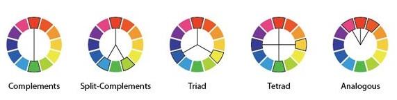
Human vision is trichromatic, with our retinas housing three types of color receptors characterized by different absorption spectra. Consequently, all color systems are grounded in the theory of three primary colors: RYB (red, yellow, blue), RGB (red, green, blue), or CMY (cyan, magenta, yellow). Newton’s color circle, foundational to all color harmony theories, is rooted in this concept, highlighting the fundamental importance of three primary colors in our understanding of color. This principle holds significance in shaping a brand’s visual identity.
Colour harmony is two or more colours seen in neighbouring areas that produce a pleasing effect. Many of the colour harmony systems can be represented through geometric chords. Below are some examples of geometric chords that identify harmonious colours:
The geometry of the RGB colour model based on this trichromatic colour vision can be rearranged into HSL (Hue Saturation Lightness) or HSV (Hue Saturation Value) models.
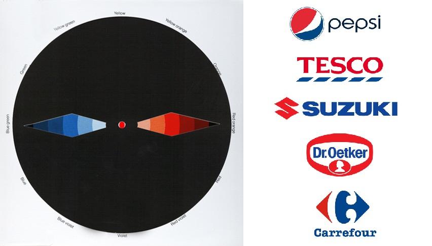
How does this apply for the real world? Here are some visual examples of global brands that use colours that correlate to colour harmony theories. The colour star used is based on the CMY model.
Example 1: Brands that use complementary colour harmony
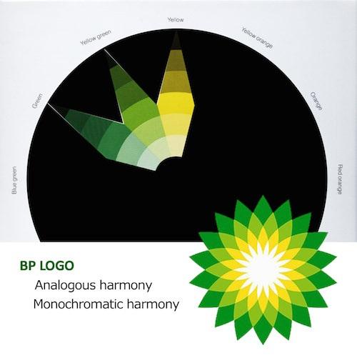
Example 2: BP uses both analogous and monochromatic harmony
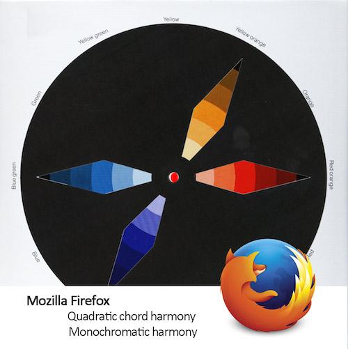
Example 3: Mozilla Firefox uses quadratic and monochromatic harmony
Need help picking your colours? Use https://kuler.adobe.com
Want to catch attention? Try the 60-30-10 Rule with Colour Contrast
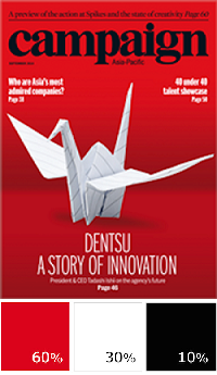
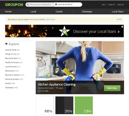
Color plays a pivotal role in brand identity, influencing emotional responses and long-term impressions. According to a study by Loyola Maryland University, the strategic use of color can boost brand recognition by up to 80%. Designers often adhere to the 60-30-10 Rule, allocating percentages to dominant, secondary, and accent colors respectively in key visuals or print advertisements. This rule ensures visual harmony and balance, contributing to the overall effectiveness of a brand’s identity.
Example 1: Campaign Magazine using the 60-30-10 rule
Example 2: Groupon Website
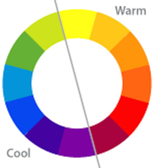
Accent colours generally create some form of contrast to make an image more striking. Contrast can successfully be achieved by using a complementary colour, a colour of a different brightness or opposing cool/warm colours. The colour wheel can be divided into warm and cool colours as depicted below.
How to make sure your colour stays great in print
Color is a crucial aspect of brand identity, but its reproduction can vary between digital and print mediums. Achieving consistency from digital screens to offline materials like holiday cards, product packaging, and store designs poses a common challenge for marketers. Attention to color calibration and understanding device dependencies is essential to maintain the integrity of a brand’s visual identity across diverse channels.
Here are 7 tips you can do to make sure your colour stays great in print.
1. Do your research. Different print vendors have different specifications so either find a print shop with specifications that suit you or adjust to your print shop’s specifications. Specifications can vary from margins and bleeds to what file and colour format they require documents to be in.
2. Convert to CMYK. Printers use a CMYK colour model whereas digital files generally are produced in RGB, by converting to CMYK you are preparing your file for print and reducing the risk of receiving the wrong colours. However be aware of the print vendors specifications, some print shops expect to receive RGB files to have different colour adjustment settings. Black and white printing needs to be done in grayscale.
3. Check your resolution. For the best results, all images need to be at least 260 DPI (dots per inch) or even 300 DPI. Original sizes will naturally be better quality than stretched images.
4. Provide a hard copy sample. By providing a hard copy sample of the correct size with the correct colour, you are providing the printer with vital information about your requirements for the final product. The printer can compare his own sample runs with the hard copy and adjust settings accordingly.
5. Choose your paper. Paper is available in different colours, weights and finishes that can greatly affect the appearance of colour and the feel of a final product. If necessary sample run a page or two on different types of paper to choose which you prefer.
6. Sample Run. Do not underestimate the value of printing test pages or even the whole file, even doing this on your own printer before sending it to the print shop can make you aware of any problematic areas that you and the printer need to be aware of.
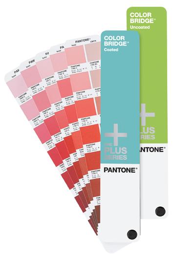
7. Consider pantones. The Pantone Matching System (PMS) are the best way to ensure consistent colour accuracy. It is a standardised colour reproduction system that uses colour swatches, which most print shops can accommodate. You can receive the swatches in hard copy choose one and refer the code to the printers, ensuring you receive the same colour.


To improve your experience, we use cookies to provide social media features, offer you content that targets your particular interests, and analyse the performance of our advertising campaigns. By clicking on “Accept” you consent to all cookies. You also have the option to click “Reject” to limit the use of certain types of cookies. Please be aware that rejecting cookies may affect your website browsing experience and limit the use of some personalised features.