Search for content of interest

  • About
  • ServiceS
    • Branding
    • Innovation
    • Naming
    • Strategy
    • Research
    • Design
  • Work
  • Insights
  • News
  • LOCATIONS
    • Shanghai
    • Paris
    • New York
    • Singapore
    • Malaysia

CN FR
  • About
  • ServiceS
    • Branding
    • Innovation
    • Naming
    • Strategy
    • Research
    • Design
  • Work
  • Insights
  • News
  • LOCATIONS
    • Shanghai
    • Paris
    • New York
    • Singapore
    • Malaysia
CONTACT

EN

  • CN
  • FR

Home Insights Our Thinking Detail

EXPERTISE

  • Strategy

INDUSTRY

  • Tech & Digital
Contact Us

Color Wars: Multi-Branded Strategy in French Telecommunications

Multi-branded strategy in French telecommunications echoes the industry trends observed in automotive. As the automotive sector engages in discussions around geographic origins and distinct brand identities, French telecom giants adopt similar approaches. Explore the nuances of branding as major telecom players draw inspiration from automotive counterparts, creating unique identities in a competitive landscape. From the technological prowess associated with German cars to the cultural flair embodied by Renault’s “French Touch,” witness how these strategies unfold in the realm of French telecommunications.

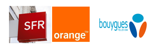
A multi-branded strategy in French telecommunications unfolds through distinctive corporate colors. As major players navigate the branding landscape, explore how their visual identities evolve. Formerly France Telecom, the group transformed into Orange, embracing a vibrant orange logo. SFR, the second-largest telecom company, integrates its corporate color into “Red” packages. Meanwhile, Bouygues Telecom maintains a dominant blue, evolving its logo subtly. Witness the strategic use of colors in the competitive world of French telecommunications. 

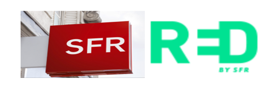
But since February 16, SFR’s RED offer has unexpectedly gone green.

To better understand this striking change, let’s first have a quick look back.

Everything started in 2011 as the French mobile landscape saw the arrival of a new actor, Free Mobile. Thanks to a clever disruptive strategy, Free rapidly gained market shares and pushed the three well-established operators to offer low-cost, no-contract monthly plans exclusively available online.

This raised several crucial questions for all mobile operators: How to compete with Free Mobile with a low-cost offer while maintaining the existing core offer?  Should this new low-cost offer be completely different than what the umbrella brand is already providing or should there be a link between them? Foundationally, the three main telecom providers developed new product brands in line with a House of Brands strategy, creating independent identities for their new offerings. Analyzing their names and visual identities provides useful insights for understanding these three telecom companies’ strategies.

Explore the nuanced multi-branded strategy in French telecommunications as Orange introduces Sosh. Distinct from the parent brand, Sosh’s identity, featuring a white lowercase font on a vibrant rectangular background, maintains a subtle connection. The bold “S,” inclined rectangle, and tagline convey a more assertive and quirky image, departing from Orange’s classic aesthetic. Uncover how Sosh, with its unique approach, adds a touch of vibrancy and individuality to the telecom landscape in France.

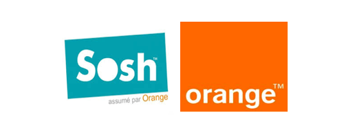
In a word, while they share similar values, Sosh could be defined as Orange’s crazy, unconventional cousin, with its unique visual identity and personality.

Bouygues Telecom unveiled B&YOU during the same period but adopted a different strategy, insisting on the affiliation between the two offers. First, the brand kept the letter B at the start of both names, creating a phonetic and visual link with the original brand. Similarities do not stop here: both logos use blue as their main color even if B&YOU progressively turns into green, and the tagline “an idea by Bouygues Telecom” reinforces their mutual relationship. Just like Sosh, B&YOU is bolder, more connecting and highlights the idea of a social and individual relationship.

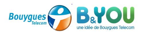
B&YOU could be referred to as Bouygues Telecom’s web-savvy, millennial son.

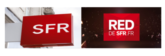
For its initial strategy, SFR’s non-binding offer was strongly associated with the original brand. Called “Red by SFR”, it immediately evoked the parent brand through its bold color identity. Using a similar typeface of white capital letters on a red rectangular pattern similar to the original brand, RED by SFR unambiguously showed its relationship to the parent brand – in this particular market situation, it did not have sufficient differentiating elements to emerge as an independent concept.
 

Interestingly enough, all three actors adopted different strategies:

  • Weak relation: Orange/Sosh: the non-binding offer is complementary of the original brand but has its own distinctive identity.
  • Average relation: Bouygues/B&YOU: the non-binding offer is another arm of the original brand but slowly tries to impose its own personality.
  • Strong relation: SFR/RED: the non-binding offer is an integral part of the parent brand.

SO WHAT IS BEHIND SFR’S NEW GREEN STRATEGY?

By analyzing the new identity, we can notice that the name ‘RED’ creates a link with SFR’s institutional codes: both have similar structures with three capital letters sharing R as a common letter. But the new RED logo asserts its personality by breaking ties with the original red square background, using bright green to create something more open and without any boundaries. The new typography is bold and the brand plays with letters to create a symbol that reminds us of an electric plug or an emoticon. We can feel SFR’s desire to create a unique concept in line with the codes of simple, essential, hassle-free offers emerging in other industries. Choosing green as the main color is also a radical breakdown from both a visual and meaning perspective. This move matches the latest design trends leaning upgrade towards cooler, fresher colors that convey a sense of simple and quiet happiness.
SFR thus managed to create an autonomous brand disconnected from the parent brand. However, when looking at all the no-contract mobile phone offers available on the market today, we can see that the differentiation between the three brands is less pronounced than it used to be since they are now all using surprisingly similar color palettes.
In an effort to differentiate from their parent brands, the sub-brands ironically created a color scheme in tune with each other. Are blue-green hues becoming symbols for a low-cost, simple phone plans in the French market?
  • SHARE
  • 
  • 
  • 
  • 
BACK

Sign up for our newsletter to get the latest insights, tips, and trends in branding, naming and innovation.

Related Article




What’s in a Name? Testing Your Brand’s Verbal Assets

Unraveling the significance of a brand's verbal assets is like delving into the essence of its identity. The name encapsulates the fundamental attributes, becoming the co…

Digital Lessons from China: Gamification as a UX Game-Changer

Digital Lessons from China: Elevating UX with Gamification In the dynamic landscape of digital experiences, a stark contrast emerges when comparing the average user journ…

Slogan Analysis: Car Slogans in China

As environment-friendly cars become an increasingly important market segment, more and more companies are heavily investing in R&D to come up with tomorrow’s winning …

Global Branding Localization: 5 Best and Worst Chinese Adaptations

Just as hiring an interpreter ensures eloquent communication with business partners, adapting your corporate communication is crucial for conveying brand values, position…

Merging Brands, Merging Names

Surviving in rapid economic growth sometimes calls for changing corporate structures, and mergers and acquisitions has become a strategy for many global brands. Statistic…

Behavioral Economics in Brand Research and Marketing

In brand research and marketing, there is always a new buzzword on the block: biometrics, neuromarketing, big data, and small data. One such buzzword is behavioral econom…

Fragmented Time in China: How Chinese Spend 3.9 Hours on Smartphones Every Day

Fragmented Time in China is a unique phenomenon defined by consumers as the numerous instances during the day when there's free time to spare – whether waiting for someon…

The Trademark Battle between Adidas and Adivon, a brand that represents the grass-roots of China?

When it comes to trademark, it is a continuing battle in China. In May 2013, the 5-year trademark dispute between sportswear giant Adidas and local brand Adivon has final…

Ready to take your brand to new heights?

Let's start a conversation.
  • NEWSLETTER
  • CAREERS
  • PRIVACY POLICY
  • Labbrand Group
  • Labbrand
  • Madjor
  • SpringPillar

* Will be used in accordance with our Privacy Policy

A Labbrand Group Company © 2005-2025 Labbrand All rights reserved

沪ICP备17001253号-3
  • Follow us:
  • 
  • 
  • 
  • 
  • 
  • 

Contact us to get the latest insights, tips, and trends in branding, naming, and innovation.

* Will be used in accordance with our Privacy Policy

Cookie Notice

To improve your experience, we use cookies to provide social media features, offer you content that targets your particular interests, and analyse the performance of our advertising campaigns. By clicking on “Accept” you consent to all cookies. You also have the option to click “Reject” to limit the use of certain types of cookies. Please be aware that rejecting cookies may affect your website browsing experience and limit the use of some personalised features.

Accept Reject